I’m just coming back from Build 2014 and it was a great pleasure to talk to customers/developers.  It is one of the best parts of my job right now in seeing how customers use the technology our team represents.  If you are a XAML developer and didn’t have a chance to go to Build or haven’t watched all the sessions, here’s a quick short list of recommendations I’d have:

There are many more (app model, localization, accessibility, tiles, notifications, etc.) so please do look at the event site and download/watch your favorites.  I think the list above gives you a good intro to the UI area changes and introduction to the concepts of Universal Windows apps.  If you haven’t heard of that concept yet, you can jump to the Keynote from Day 1 for the quick demo.

Add Reference

The last session above is one that I want to write about today in this post.  In current form, a Universal Windows app in Visual Studio Update 2 allows you to maximize your sharing of code/assets across your Windows Store and Windows Phone app.  If you are like most developers, you rely on a great ecosystem of libraries and SDKs to augment your app and add functionality, UI or make things easier to develop.  In our keynote sample, the app we migrated (SportsLeague app) used JSON.NET and we showed that we are able to re-use the same library (which in this case happened to be a Portable Class Library, aka PCL) across the different endpoints.

One thing that is important is that you will need to add these references to each of your project ‘heads’ (the term we use to describe each endpoint in a shared project solution).  For some that are using direct binary DLL references to PCL libraries should be okay.  For others that are using Extension SDKs and/or NuGet packages, you may find yourself into some scenarios where either the SDK is different or the NuGet package isn’t updated yet to understand the Windows Phone 8.1 project type.  There are a number of these that are already updated like JSON.NET, Caliburn.Micro, etc.  If you find yourself using a library that isn’t updated yet, you may want/need to prod the author to update.  Better yet, if it is Open Source, submit a pull request with the update yourself!

SQLite or other native Extension SDKs

The other category are things that might be platform-specific and/or native.  These things are generally more complex than something that might work in a PCL and have dependencies on various native compiler/linker options or have been compiled in such a way that are different for the Phone device versus a tablet device.  One such example is SQLite.

SQLite is an in-process library that implements a self-contained, serverless, zero-configuration, transactional SQL database engine. The code for SQLite is in the public domain and is thus free for use for any purpose, commercial or private. SQLite is currently found in more applications than we can count, including several high-profile projects.

SQLite links against the C++ Runtime and as such needs to make sure the right linking happens for the phone and tablet CRT profiles.  Right now, the SQLite for Windows Phone Runtime 8.1 is in some testing, but since a lot of people have been asking me about it, I’ll share my private build from source of the SDK.  This comes with a “works on my machine” guarantee :-).  This is a build of SQLite from their source, which is Open Source, and modified to compile/link against the Windows Phone 8.1 SDK.  When the official version comes out you should update to that version from their site.  For now, you can download my build of  UPDATE (12-MAY-2014): SQLite team put out their official build for Windows Phone 8.1: SQLite for Windows Phone 8.1 here.

Updating your Extension SDKs and NuGet packages

If you are an author of one of these SDKs that people use, please consider doing an update to make your customers happy.  If you are an Extension SDK provider you will want to produces an Extension SDK for Windows Phone 8.1.  If you already have a WinRT SDK, then you may just be able to copy the manifest, etc. and just produce changes to your manifest so it installs to the right location.  Here is an example:

<Installation AllUsers="true" Scope="Global">
  <InstallationTarget Id="Microsoft.ExtensionSDK" 
    TargetPlatformIdentifier="WindowsPhoneApp" 
    TargetPlatformVersion="v8.1" 
    SdkName="SQLite.WinRTPhone81" SdkVersion="3.8.4.1" />
</Installation>

As you can see in lines 3,4 above the TPI/V values are different than your existing SDK which tell the SDK where to install.

If you are an author of a NuGet package, you also will want to make your package Windows Phone 8.1 aware.  Again, if you have an existing package that works with Windows 8.1, then you may just be able to duplicate the content/lib/tools to a folder labeled ‘wpa81’ and test that out.  Example NuSpec:

<?xml version="1.0" encoding="utf-8"?>
<package xmlns="http://schemas.microsoft.com/packaging/2010/07/nuspec.xsd">
    <metadata>
        <id>Callisto</id>
        <version>1.5.0</version>
        <title>Callisto</title>
        <authors>Tim Heuer</authors>
        <owners>Tim Heuer</owners>
    </metadata>
    <files>
        <file src="lib\portable-win81+wpa81" target="lib\portable-win81+wpa81" />
    </files>
</package>

If you see at line 11 the ‘portable-win81+wpa81’ it allows me to combine the two targets telling NuGet this applies to either.  Of course if I had any nuanced differences I could also just use ‘wpa81’ and put the phone-specific lib (or assets) there.

In both cases if you have any UI aspects, most likely you may want to do some work here to make sure that any UI assets are tailored to the device targets for a great experience.

I hope this helps clarify some of the reference questions that I’ve received and I hope that if you are an SDK author you will work quickly to help your customers realize their goals of a universal Windows app!

Hope this helps!

Recently I’ve been writing a few XAML Behaviors for Callisto and looking to take some contributions on this front as well.  One thing that I realized is that this will bring in a new dependency for my toolkit.  I’m still trying to figure out if I want to do that or not, but that’s not what this post is about.  My #1 consumers of Callisto are using the NuGet package.  I also distribute Callisto through the Visual Studio gallery as an Extension SDK. 

What’s the difference you ask?

Extension SDK vs. NuGet package

While not an official answer, this is my basic definition I always describe to people.  It is not complete comparing all features but defines what I see as the core difference between the two.

An Extension SDK is installed per-machine and allows you to install it once and use for multiple projects.  It is deployed through the Visual Studio extensions mechanism (VSIX) which has a feature that allows for you to be notified if a version is updated in the IDE.  This is a proactive update that even if you just have VS open you get a little toast if any of your extensions are updated…very handy.  Extension SDKs also have some cool features about enabling you to supply design-time assets that don’t ship with your application and also provide some nice per-architecture deployment capabilities rather easily.  Extensions SDKs have great support for native projects as well.

NOTE: People sometimes confuse VSIX == Extension SDK.  VSIX is a packaging and installer mechanism, not an SDK only.  You can have a VSIX that deploys a tool, templates or an SDK. 

A NuGet package is installed per-project when added as a reference to your project in Visual Studio.  You can add them similarly through the “Add Reference” type dialogs (although in VS it is called Manage NuGet References) and once you select your package it is installed (per the package’s manifest instructions) into your project.  If you want to use the package for multiple projects, you must repeat this step for each project.  One benefit of the NuGet route is that it does become a part of your project, you can check it in to source control, etc.  One disadvantage currently is it doesn’t do the design-time aspects and the per-architecture deployment aspects well.

You might look at these differences and wonder why you would want to take a dependency on a per-machine item in a per-project package.  And you’d be right to ask that question.  Again, I’m still wondering myself.  However one thing to note is some Microsoft-delivered SDKs are delivered shipped with Visual Studio as Extension SDKs, as is the case with the Behaviors SDK.  So you can’t have VS installed without it, but NuGet also can be used in non-VS scenarios as well.  This can be complex depending on your package/needs.  For mine, this might be acceptable.

Telling your NuGet package to include an Extension SDK

I admit that this title is a bit misleading, but allow me to explain first.  NuGet allows for you to extend the package install a bit by including a PowerShell script to run during install (and uninstall) of the package.  This script can give you context of 4 things in your project/tools environment: install path (where the package is being installed), tools path (the folder where the script will actually reside), package (the NuGet package object) and project (a reference to the IDE Project instance).  It is this last piece that helps you manipulate the project structure.

In Visual Studio 2012 a new interface was added to the VS project extensibility to accommodate automating adding Extension SDKs.  This new interface, References2, includes a new method AddSDK.  This is the hook where you can add Extension SDKs.

NOTE: The other methods of Add() are still supported and would allow you to add references to files, GAC assemblies, etc.

The AddSDK has 2 parameters but only one is required, the identifier of the Extension SDK (it is weird to me that the first param is optional but oh well).  The ID of the Extension SDK is the name of the SDK (as defined by the deployed folder or the ProductFamilyName in the SDKManifest.xml) combined with the version number.  A final string to pass in the second parameter of AddSDK is then something like:

BehaviorsXamlSDKManaged, version=12.0

Now that we know this format we can add this to our NuGet install PowerShell script.  Here’s an example of what one might look like:

param($installPath, $toolsPath, $package, $project)
$moniker = $project.Properties.Item("TargetFrameworkMoniker").Value
$frameworkName = New-Object System.Runtime.Versioning.FrameworkName($moniker)
Write-Host "TargetFrameworkMoniker: " $moniker
if ($frameworkName.Version.Build -ge 1)
{
    Write-Host "Adding Behaviors SDK (XAML)"
    $project.Object.References.AddSDK("Behaviors SDK (XAML)", "BehaviorsXamlSDKManaged, version=12.0")
}

Notice the first line with the param() function.  Per the NuGet documentation this is required to get the environment objects like $project.  Now in line 8 we have a reference to the VSProject, then can get at its object model, get to the references and add one to an Extension SDK, in this case the Behaviors SDK installed with Visual Studio 2013.

The tricky thing with this approach is that when someone were to remove a package you may be tempted to remove the SDK reference as well.  Since there is not really good tracking whether someone may be using the reference, it is advised against that approach.  Your app developer may be using that Extension SDK now outside of your package and you have no reliable way of knowing that.  What you can do is alert the developer during uninstall:

param($installPath, $toolsPath, $package, $project)
Write-Host "Callisto was removed, however Blend SDK (XAML) was not
 as it may be a dependent reference on other things in your project.
  If you do not need it, manually remove it."

Not awesome, but helpful at least to output some data to the developer.

Summary

Again, while this may be unconventional and some NuGet purists will scoff at the mere suggestion of doing something like this, it is good to know this is easily available.  My goal is to help developers (including myself) and if there are ways to merge these two worlds of Extension SDKs and NuGet packages until (if?) they unify then by all means I love helping make my productivity better.

Hope this helps anyone!

I’m an avid user of Twitter (join me on Twitter @timheuer) for things social, family and technical.  I use it to keep in touch with friends, learn things from technical sources, get news and otherwise interact with names I’ve never met in person.  My use of Twitter has changed much over the years and I’ve found myself just using the web site more and more while on the desktop where a full browser is available.  On my mobile I use native clients but presently not one of the ‘official’ Twitter mobile apps (I find them less full-featured than the 3rd party ones which also offer a better performing experience for me).  In my use of the web site I’ve noticed more and more links that say “view summary” in my feed. 

Twitter Summary Card sample

Sample Twitter Summary Card from dev.twitter.com

When expanding this, the twitter post (which is limited to 140 characters itself) basically provides more information about the post.  The most frequent I’ve seen is what Twitter calls a Summary Card, which reads metadata from the URL posted in the Tweet, effectively extending the 140 character limitation a bit (however summary descriptions are limited to 200 characters).  I post to Twitter most of my blog posts and thought it would be a great little enhancement to provide this summary data in the feed view (it isn’t expanded by default so users must explicitly click ‘view summary’ and thus there is no real risk of making your Twitter feed more noisy without you choosing to read more).

Learning about Twitter Cards

I recently learned more about these after a quick exchange with @JeffSand (former director at Channel 9, now at Twitter) about another implementation (more on that later) and thought I’d get into doing the Summary Card for my own personal use.  Twitter has some pretty decent documentation on this topic on their Dev center.  There are a few types of Cards available for content authors to leverage and the great thing is that you, the content author, really just have to add metadata to your content and that’s it.  Twitter feeds/apps do the rest by interpreting and displaying that data in a Card view in the feed.

Summary Cards seem to be the most popular to me but that could be just my own personal use.  The others that I could see add value are the App info/install and deep-linking ones.  These do presently, however, seem to add most value in the mobile space and not the desktop space.

  • App Cards – provide a link to mobile apps and product page information.  This is currently limited to iOS and Google Play store listings it seems.  There is also some documentation on App Install/Deep-linking techniques.
  • Photo Cards – provide a good representation of an image in-line.  You see this for images from Twitter, Flicker, SkyDrive, etc.  Sadly, Instagram chose not to pull this support for their usage last year (yay customers…grrr).
  • Player Card – seems great for podcast publishers!  You see YouTube usage of this most of the time as well.
  • Product Cards – I’ve not seen usage of this in my interactions but I would imagine we’ll see more of this in sponsored posts/ads as they become more prevalent

After reading about these, I set out to add this metadata to my own content on my site.

Modifying my blog engine

At present I use Subtext as my blogging engine of choice.  This is due to some choices made long ago using .Text and then migrating to Subtext when that transitioned the work.  Subtext has served me very well over the years but is showing its age more recently as I’ve been desiring to modernize some things and leverage the vast ecosystem of WordPress type themes and plugins.  Still, it is Open Source, written in ASP.NET and so I could modify things as I need.

I first went to the source of Subtext and thought I’d just upgrade.  The version I run is the latest stable/release build of Subtext and hasn’t really evolved since that version release a few years back.  The version on GitHub now is moving toward ASP.NET 4, which is good and I thought I’d just move to that.  I had an immensely painful time trying to do this upgrade and ultimately decided against it (blog post on my ASP.NET migration woes perhaps to come) as there wasn’t much return on my time investment at present to do that.

The first thing you have to do is set up your Twitter Card.  Twitter’s docs have a cool Cards validator tool (only works on Webkit browsers for some reason) to give you a display of your card so you can tweak settings.  Once you do this and have your metadata set up, you need to submit your URI to Twitter for validation.  This step is critical or they won’t show up.  This step is also not entirely clear in the process and you may think that just setting the META tags are sufficient…they are not.  Use the validator tool to see the second tab to “Validate & Apply” for your card view.  I did a basic Summary Card for my entire site to get through this process so I could test/validate my own logic for the per-post metadata later.

I wanted the data from each of my posts to be a unique Summary Card as I felt that has been the most valuable I’ve used in my feed.  Card data is implemented as META tags so your mileage may vary on how you need to implement this. 

If you are a WordPress user, there is an amazing ecosystem of plugin developers who have already done this for you and you just install a plugin.  It doesn’t seem that Twitter provides a directory of recommended plugins for popular CMS systems, so I can’t speak to which ones are reliable or not.  Twitter Cards for WordPress seems to have a lot of downloads so I’d check that one out first if you are a WordPress user.

Unfortunately the way Subtext is architected doesn’t easily let me jam new META tags into my site that are dynamic (there is a tool that allows me to easily add static ones without altering the page itself).  A few properties for my cards would indeed be static (creator, site, domain) so I just used the Subtext admin area to add those.  The title and description I wanted to be content-specific.  I didn’t modify the Subtext source, but rather created my own ASP.NET 3.5 control that did this.  I put the code on my GitHub repository for you to view…you’ll see it is a quick few lines of code.  My control basically gets the context of the request, pulls the title/body out and sets these META tags.  Now whenever I post a URL to Twitter, my Summary Card option will be there and provide some helpful information to the reader (hopefully).

Viewing the results on different platforms

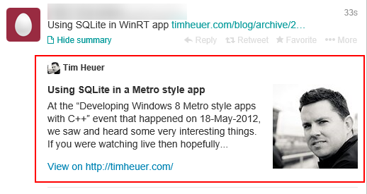
Looking at the results, I’m happy with my quick hack.  Outside of the web site, the cards only show on Twitter official apps it seems.  Here are some examples based on my site content.  The red box is only there to illustrate what content is actually the card:

Twitter Summary Card web view

View on twitter.com when expanding ‘view summary’

Twitter Summary Card iOS

View on Twitter for iOS when viewing full Tweet detail

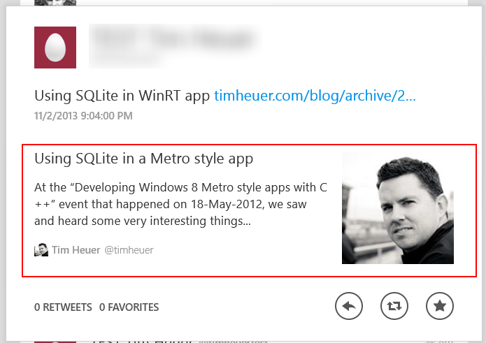
Twitter Summary Card on Windows

View on Twitter for Windows

Simple metadata additions providing some more content beyond the 140 characters Twitter allows in the post itself.  I chose to use my face in the image because my blog doesn’t associate a “poster” image per-post.  If yours does, you should use that if available and change the twitter:image value as needed.

Summary

This didn’t take me long to implement and adds some additional value on to the content I post on Twitter (I hope).  Again, this is optional for the user, they have to click “view summary” or view the Tweet in details view to see this, so there is no general feed noise here.  I have found that it appears to cache the results per URL so there may be an issue if you change title/description on a post.  I’ve found that my initial tests wouldn’t update the previous Cards I had which were just the blog summary data…that’s unfortunate, but now I know.

When I talked with @JeffSand he mentioned this would be nice to have the App cards for Windows Phone/Windows Store apps (ugh, we really have to do something about that name).  I think this is a great idea!  Unfortunately it looks like Twitter needs to do something to understand Windows apps as it only understands iOS/Google Play app stores.  I’ve started a conversation with Jeff’s team as of the date of this writing and hopefully we can understand what might be required and deliver some goodness here.

If you are a content publisher (hint: if you are a blogger you are) this is a subtle and helpful addition to your content in my opinion.  If you are podcaster, consider using the Player Card as well.  It was really easy to understand and implement and I like the results.

Hope this helps!

In a previous post I talked about removing the dependency on StandardStyles.xaml from your Windows 8.1 projects.  One of those tips noted that a popular use of the styles in that helper file was the AppBarButton styles and the roughly 200 different glyphs used for AppBarButtons.  I thought I’d dig a little deeper quickly on the use of AppBarButton since I received a few pieces of email about it.

Typical Scenario – Symbol Icons

The AppBarButton class is new in Windows 8.1 and primarily intended for use the CommandBar scenario, providing the UI, behavior and accessibility needs to the control. 

NOTE: CommandBar is new in Windows 8.1 and meant to serve as the best-practices control for AppBars that are non-custom and use only command buttons.  It provides automatic sizing logic (meaning commands will drop as the window gets smaller) built-in as well as better keyboarding support for navigating through the commands in the AppBar.  If you are using AppBar and only have the ‘standard’ button UI, you should be using CommandBar instead in your Windows 8.1 app.

It allows you to rapidly create the UI by setting two properties: Label and Icon.  Here’s a quick example:

<AppBarButton Label="Reply via Email" Icon="MailReply" />

which produces:

Reply via Email icon image

That’s it.  The functionality still remains to be a button and the API surround that type.  This just gives you a quick way to set the label and visual.  All the visual states (pressed/hover/etc) are taken care of for you.  We’ve also pushed through the Label property to be the AutomationProperties.Name value for the button for you, providing accessibility by default here.  This Icon property method is the shortcut version of this more verbose method:

<AppBarButton Label="Reply via Email">
    <AppBarButton.Icon>
        <SymbolIcon Symbol="MailReply" />
    </AppBarButton.Icon>
</AppBarButton>

As you can see the attached property for ButtonBase is where the Icon property lives.  Because we have this Icon property we can use other methods as well.  We also expose an IsCompact property on the AppBarButton types that will shrink the margins and drop the labels automatically for you for a smaller view.  This is what the CommandBar sets when the Window size gets too small to fit the elements.

Using other custom fonts as Icon sources

If one of the 190 included Icon types does not suit your needs you can still use the AppBarButton with your own custom icons.  I HIGHLY recommend using the Font approach as it provides a great automatic scaling method for your icons and seems to be the direction of a lot of apps on the web as well.  While you can make your own Symbol font, there are also many great providers out there that you can use.

NOTE: I am not a lawyer and you should consult the font provider’s license for acceptable use policies/rights/restrictions on using fonts that are embedded in your application.  Don’t assume that every font is acceptable to use in this manner just because it is TTF/OTF – be sure to consult the license if you are not the font author.

Let’s say I want to add some social media commands to my app.  I can use the popular Modern UI Icons library, which happens to provide a font download of the social icons created.  Once unzipped I include the TTF file in my project (I could have used OTF but since TTF is provided I’ll use that – also note I renamed the file in my VS project) and then can use in my app:

<AppBarButton Label="Tweet This">
    <AppBarButton.Icon>
        <FontIcon FontFamily="ms-appx:///modernuiicons.ttf#Modern-UI-Icons---Social" 
            Margin="0,2,0,0" Glyph="&#xe045;" FontSize="37.333" />
    </AppBarButton.Icon>
</AppBarButton>
<AppBarButton Label="Review on Yelp">
    <AppBarButton.Icon>
        <FontIcon FontFamily="ms-appx:///modernuiicons.ttf#Modern-UI-Icons---Social" 
            Margin="0,2,0,0" Glyph="&#xe04f;" FontSize="37.333" />
    </AppBarButton.Icon>
</AppBarButton>

which produces:

Modern UI Icon sample usage

Pretty cool.  Now when using Fonts sometimes it is tricky to figure out the right value to set after the “#” symbol in the FontFamily path.  The trick I use on Windows is to open the TTF/OTF file and it will show the font preview as well as the “Font name” in the very first.  This is the value you want to specify after the path to the actual file.  The Glyph value you supply is totally dependent upon the font you choose.  Most authors use Unicode value ranges for symbols, but I’ve seen some that would be as simple as “B” that you could put there.  This is something you should consult the font provider for a mapping (Modern UI Icons provides a nice web page preview with all the values next to the icons).  Also notice that some font information in the font may vary and you may have to do some adjustments.  For me, I found I had to nudge the Modern UI Icons 2px down as well as size up the FontSize value to my liking.

Other variations of Icon

There are two other variations of Icons you can use.  I recommend using the default Symbol method first as almost always you’ll find something you need in that 190 set.  Second I would recommend looking at the Font approach.  These last two have some caveats that aren’t as “drop in” simple to use usually and greatly depend on the graphic data provided.

  • PathIcon – this is for providing vector data using the XAML Path data format.  This is vector and will scale nicely.  You must, however, provide the vector data already sized to 40px so it fits within the template.  For some this can be difficult if just provided some data.  Using tools like Inkscape or Snycfusion Metro Studio may help.
  • BitmapIcon – this works for providing PNG based images.  Note that these will NOT automatically scale.  You would want to provide the various scale-factor images (100,140,180) for each image provided here.  This can be a cumbersome task and if not done won’t look well on higher resolution displays.  Additionally BitmapIcon doesn’t yield great fidelity for non-rectangular items.

Using Visual Studio

In Visual Studio 2013 some great tooling around this experience was provided so you can easily pick out visuals for your AppBar buttons.  In the property pane for the designer you can see the various properties you can set:

Visual Studio AppBarButton Icon tooling image

There is also tooling for changing to the other types of icons mentioned above as well.

Summary

We wanted to make some things simpler, reduce VS template-provided code and improve app usability/accessibility.  While this feature may seem simple, it is useful and can help you focus on the core of your application rather than some fundamental pieces.  If you are using other button styles and some of the more standard icons, I encourage you to move to AppBarButton with the default Icon types provided by the framework.  Be sure to check out the AppBar Windows SDK Sample for playing around with the concepts discussed in this post.

Hope this helps!

If you’ve created a Windows 8 app using XAML then you’ve likely seen a file in the project called StandardStyles.xaml in the Common folder and merged in with your application.  As I’ve seen apps developed I’ve seen people pretty much treat this as a system component and not change it at all.  Sometimes that’s good, but mostly it has been bad.  There are a lot of apps that I’ve seen that don’t use a lot of the styles in that dictionary, but don’t do anything to trim the file or even remove it if not needed.

The file was included in Windows 8 Visual Studio project templates to help style some areas of the template.  In looking at performance in Windows 8.1 we saw that people were not removing this file or unused styles in this file.  We also saw that there was benefit to including some of these styles in the framework because of some styles/template deferred loading we implemented in Windows 8.1.  As such for almost all apps we’ve seen in practice, the styles provided in Windows 8/VS2012’s StandardStyles.xaml file can be removed from your application and replaced with styles in the XAML framework.

Text Styles

A big portion of the file is providing some text styles that map to the typographic ramp for the Windows design language.  Roughly 100 lines of text styling can now be migrated to new framework-provided text styles.  Here’s a mapping of what you should examine replacing with in your Windows 8.1 app:

StandardStyles.xaml (in VS 2012) Windows 8.1 XAML Framework-provided name
BasicTextStyle BaseTextBlockStyle
BaselineTextStyle n/a (merged with BaseTextBlockStyle)
HeaderTextStyle HeaderTextBlockStyle
SubheaderTextStyle SubheaderTextBlockStyle
TitleTextStyle TitleTextBlockStyle
SubtitleTextStyle SubtitleTextBlockStyle
BodyTextStyle BodyTextBlockStyle
CaptionTextStyle CaptionTextBlockStyle
BaseRichTextStyle BaseRichTextBlockStyle
BaselineRichTextStyle n/a (merged with BaseRichTextBlockStyle)
BodyRichTextStyle BodyRichTextBlockStyle
ItemRichTextStyle n/a (was same as BodyRichTextBlockStyle)


The replacement is pretty simple as wherever you were using {StaticResource SomeTextStyle} you would now change to {StaticResource FrameworkProvidedStyle} (obviously using the correct names).  As with anything, when making these changes test your app to ensure your UI fidelity remains as you expect.  Should you need to continue to style some of the above, you could use these as your BasedOn starting point.

Button Styles

Another area was a series of Button styles around Back button, TextBlock buttons and the most used AppBarButton styles.  TextButtonStyle is now TextBlockButtonStyle and serves as a styled Button for areas like GridView clickable section headers, etc. 

There were also a few Back button styles.  With the introduction of AppBarButton in Windows 8.1, we can provide a better/specific template style provided in the framework with the right glyphs for the arrows.  Instead of using the BackButtonStyle/SnappedBackButtonStyle in StandardStyles.xaml you should use NavigationBackButtonNormalStyle and NavigationBackButtonSmallStyle.  The normal style is the main one that you would use on pages and is the 41x41px standard back button.  The small style is the 30x30px smaller button that you might use for a narrow (formerly snapped) view or other areas.

Perhaps one of the most used areas were the AppBarButton styles.  There is roughly 1100 lines of styling for a series of button styles for the various popular glyphs of AppBar button styles.  We are now providing a typed button that is optimized for that UI and we now have included 190 icon types as a part of the base.  As an example this is what you might have had in your Windows 8 app:

<Button Style="{StaticResource PlayAppBarButtonStyle}" />

And can now be replaced with:

<AppBarButton Icon="Play" Label="Play" />

This reduces the need for the base AppBarButtonStyle as well as the others that were glyph-specific.  If you need them to be RTL specific, just add the FlowDirection property as you need it for your app.  The Label property will map directly through to the AutomationProperties.Name value by default as well for the accessibility needs.

List/Grid Item Templates/Styles

In the Grid/Split templates there were also style item templates for the use in the pages within these templates.  In looking where they were actually used, these were moved to only the pages that need them.  Many people think that your styles/templates must be in App.xaml, but this is not true and most of the time not a good performance decision.  If your style is only used in one page, put it in the resources of that page!  That is what was done with these specific styles for the VS 2013 project templates.  Some were removed in accordance with new guidance around app sizes as well.

Using Visual Studio 2013 for Styling

You may ask yourself now how you would use this or know about them or even remember them!  Luckily Visual Studio 2013 added some great new features in the tools to bring more visibility to these styles.  The resource pane is still there and would show the framework-provided styles as seen here in Blend:

System Resource style selection image

If you are an editor-only person, there is still great news as VS added Style IntelliSense!!!  As you use StaticResource you will get auto-completion on the styles that apply to that style you are on.  For example on TextBlock you will only see Styles that apply to TargetType=TextBlock as seen here:

VS Style IntelliSense image

This IntelliSense will work with your own custom styles as well and is a great productivity enhancement to the tools.  This one of my favorite new features of VS!

If you want to see the details of these styles you can use the great template-editing features in Visual Studio/Blend to inspect them as well.  Once you have the style you can now also F12 (Go to definition) on the Style itself!!!!  This will take you to the definition of the style in the framework’s generic.xaml:

Style Go to definition example

This is an amazing productivity feature that is available for all Styles in XAML, again including your own!  These styles can be manually inspected by looking at the generic.xaml that ships in the Windows SDK (location %programfiles%\Windows Kits\8.1\Include\WinRT\XAML\Design).

Summary

One of our main goals was continue to improve overall app performance for Windows 8.1 for all users.  This optimization of bringing most commonly used styles into the framework benefits developers for consistency and productivity as well as all users for shared use of these templates and reduced load/parse time for each individual app needing to provide some of these core styles.

Hope this helps!