Silverlight 2 brings a suite of controls for designers and developers to leverage within their applications.  With the Expression tools helping us to be able to skin these controls, also comes some new controls you may not have used yet as well as a new one introduced with the latest release of Silverlight 2.

Introducing TabControl.

UPDATE: Video walk-through is now live.

The TabControl is implemented in the System.Windows.Controls.Extended class library and not in the Silverlight core.  To use it make a reference to the Extended assembly and it will be available to you.  In Expression Blend you’ll see TabControl in the Custom Controls section of the Asset Library:

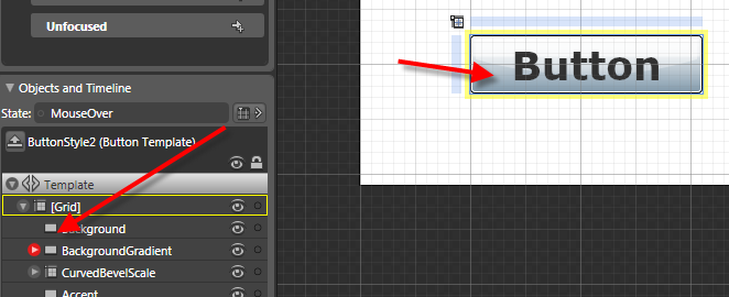
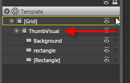
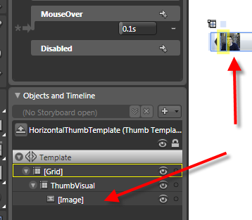
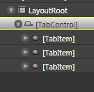
You’ll notice there is actually a TabControl and TabItem controls…to implement you’ll need them both.  In Blend, you’ll have to drag a TabControl onto the design surface.  Once you have it, double-click on the TabControl in the Objects and Timeline explorer so that it has a yellow ring around it:

Having the yellow border indicates that it is the actively selected element.  Now if you go back to the asset library, change to a TabItem and double-click the TabItem, it will be added as a child of the TabControl.  Do this several times to add as many TabItems you need:

The resulting XAML looks like this:

<ex:TabControl TabStripPlacement="Bottom" VerticalAlignment="Top" 
               Width="231.148" Height="156.611" HorizontalAlignment="Left" 
               x:Name="tabstrip1">
    <ex:TabItem Width="75" Height="20">
    </ex:TabItem>
    <ex:TabItem Width="75" Height="20" Header="Second">
    </ex:TabItem>
    <ex:TabItem Width="75" Height="20" Header="Third">
    </ex:TabItem>
</ex:TabControl>

You’ll notice the “ex” namespace with the TabControl.  Yours may be different and likely “System_Windows_Controls“ if you followed the steps above.  This is added automatically when you drag a control onto the surface from the asset library.  The namespace is actually directed in the root node of the XAML and you can change it to whatever you’d like.

The TabControl has properties you can set on it just like any other control, but one that you might find important would be the TabStripPlacement property.  This enables you to direct where the TabItems (tabs) actually get displayed: Top, Left, Right, or Bottom.  This can be set in XAML and also controlled during runtime using the Dock enumeration.

Each TabItem also has two properties to set content: Header and Content.  Header is where you would put the content for the tab itself and content direct the actual content within the TabItem.  This can be set to literal string values, but they can also be set to other content.  For example, if you want to set the content within the TabItem, you could do something like:

<ex:TabItem Width="75" Height="20" Header="Third">
    <StackPanel Orientation="Vertical">
        <TextBox x:Name="yourname" />
        <Button Content="Click me" Click="Button_Click" />
        <TextBlock x:Name="resulttext" />
    </StackPanel>
</ex:TabItem>

If you wanted to set alternate content as the Header you could likewise do that as well noting the TabItem.Header:

<ex:TabItem Width="75" Height="20">
    <ex:TabItem.Header>
        <Button Content="foo" />
    </ex:TabItem.Header>
    <Button Content="Click Me" Click="Button_Click_1"/>
</ex:TabItem>

Let us all welcome TabControl to the family.  A simple yet probably widely used control is now available for you to think of marvelous uses :-).  Remember, that TabControl (as well as the calendar and date picker controls) is located in the Extended control assembly and not the core.  Here’s an example of a TabControl using some of the methods described above:

For a video demonstration of using TabControl, visit the Silverlight community learning section and stay updated as the video will be there shortly as well as other great videos on using Silverlight 2.

Hope this helps!

If you’ve heard the news about Silverlight 2 Beta 2 and Expression Blend 2.5 (June 2008 preview), you will notice something else in addition to being able to skin your controls easier.  Remember how you may have had to create different states for your element using “MouseOver State" and then create storyboards to transition to states?  There’s now a better way.

Enter VisualStateManager.

Let’s take a look and see if we can simplify this down a bit a basic understanding.  Let’s use something that most everyone should be able to relate to with states: Button.  A button has MouseOver, MouseOut, MouseDown, etc. states that you can see.  Using VisualStateManager and the new UI ability to customize templates, we can make our lives easier.

Start in Expression Blend and drop a button on the default design surface.  I’ve created mine larger just for context, but whatever you want is fine.  You should have something like this:

Now, using the method in one of my previous posts about skinning the controls, right-click on the button and choose to edit the template.  I’d choose Edit a Copy for now to make things easier for now…keep it a document resource as well.  After you’ve done that, take a look in the upper left pallette (assuming default and you haven’t moved your palettes around…in which case you probably already know about VSM and are smarter than me anyway):

The various states of this control are represented in this particular template.  Some other controls might have a blank palette here until some are added, but Button has some default states.  As a designer now you can simply concentrate on what the final look of the element (in our case a Button) in each state.  Just define the state and what the element should look like in that state.  The State palette shows a few things.  You’ll notice “Base” as well as two other named containers, “CommonStates” and “FocusStates” which are what are called state groups and containers for different states.

Beneath that you can select a state and see it’s final state.  Want to change the MouseOver state, select it in the state palette and start customizing the template.  Let’s change the MouseOver state, select it and let’s change some properties.  By default it looks like this:

You’ll also notice a few things changed.  Basically the design surface goes into Timeline recording mode and a subtle new feature in the objects palette indicating the property being animated/changed…in this case the BackgroundGradient:

I’m selecting the BackgroundGradient element and then changing the color within the Properties palette.  Let’s change it to red.  There is no need for me to pay attention to any timeline stop points or anything, just concentrate on what I want the final Button to look like, position, etc. in this state:

That’s it.  MouseOver will now represent my new state.  I didn’t have to create any new StoryBoard elements or anything.  This is in part where VSM does some magic.  You see, the VSM engine bascially knows the beginning end states between any given transition (i.e., Normal –> MouseOver).  The VSM engine automatically handles the transition for us.  Think of it as creating a dynamic StoryBoard on the fly and executing it.  If we run the application and mouse over the Button, it changes to our state.

Notice the time in the state palette for a given state:

This controls the duration of the transition TO that final state.

The VSM model also enables you to move between states via code.  VisualStateManager.GoToState() is a static method that enables you to move between states and optionally use the transition or just get to the state.  For example if we had our Button named "foo" and had some other event we could do this:

VisualStateManager.GoToState(foo, "MouseOver", true);

The last parameter is to use the transition or not.  True would do the transition based on the duration set in that state.  False just gets to that state.

The theory is that VisualStateManager now makes it easy for us with our skinning, etc., but also separates more from the developer/designer so that the designer can concentrate on the final look and experience of the final states rather than having to code something up.

A Button used above is a simple example and I hope it helps demonstrate the VSM class available.  There could be other uses than the simple Button of course :-) and I hope to see some creative uses.  As a for instance, I've seen a lot of applications with slide-out control panel implementations.  You could use VisualStateManager and set the "collapsed" and "open" states for a control panel and just concentrate on the final stages of each and let VSM handle the transitions, etc. 

For some further designer-driven tutorials on this model, head on over to Nibbles where Celso will have some tutorials on what VSM means to designers in more depth.  Also be sure to check out Christian’s blog for more information on VisualStateManager.

Hope this helps!

This has been one of the features that I’ve been excited about for a while since I heard we were changing it.  With the release of Silverlight 2 Beta 2 and the updated preview of Expression Blend 2.5 (June 2008), skinning and styling controls within Silverlight gets a bunch easier.

Sample skins from Corrina Barber

When Silverlight 2 Beta 1 was released there was the possibility of styling/skinning controls.  It wasn’t impossible, but perhaps a bit obfuscated to the eye for people with short attention spans like myself.  You can read more about those methods here and here.  WPF designers were probably laughing that Silverlight developers might have been struggling with skinning controls.  Why?  Because Blend for WPF supports a right-click “Edit Template” functionality for WPF…so where is it for Silverlight?  In the latest release of Blend 2.5 of course!

That’s right—simpler skinning.  At RIApalooza in fact I was asked about how one would know *what* elements could be skinned, etc.  Outside of the docs, and some spelunking, it wasn’t entirely intuitive.  But now, well, let’s take a look.  Let’s take a look at Blend 2.5 June 2008 preview and adding a ScrollBar to our design surface:

You may not realize it but the ScrollBar has a lot of elements that you can skin.  The thumb, the handles, the bar, every little detail…so now in Blend 2.5 we can right-click and choose to edit that:

When you do this you are prompted for some settings, one to name the style and the second of where to put it, either in the document resources or as an application resource that other controls may subscribe to:

After you do this, your objects and timelines explorer (on the left by default unless you’ve moved it) now changes to represent the layered elements of the control you are skinning now.  Note that the “up” arrow will get you out of this mode and back to your documents visual tree of elements.  Here’s what the base template for ScrollBar looks like:

You can continue to dig further.  For example with ScrollBar, if you wanted to modify the Thumb, simply select that in the visual object tree:

then right-click on the Thumb now on the design surface and choose to edit that template and now you’ll see that you can edit the Thumb’s template rather simply:

If I wanted to I can remove the three elements that make up the HortizontalThumb and make my Thumb an Image of myself (horrible design, but proving a point):

I chose ScrollBar in this post, but you can do this with any of the controls and the process is the same.  This now makes skinning a bit more within a closer reach to most.  The reach for developers might be a bit further if you have no design skills…but I’ll gladly send you my picture if you want to use it as your navigational Thumb for ScrollBar.

One other tip is that when you have an element on the design surface that has a template skin attached to it, Blend will help you get there even faster rather than having to right-click further.  At the top there is a breadcrumb like trail and if you are on an element that has a template there will be a “Template” link you can click directly on:

Hope this helps!

So you want to read an RSS/Atom feed on the interwebs and saw the SyndicationFeed class you could use in Silverlight to give a nice RIA display of the syndicated data.  Great, no problem right, just wire up an WebClient, point it to the RSS feed on something like http://silverlight.net or something and boom, done.  Wait, what’s this 404 Not Found error?  In most cases this is going to be a result of a cross-domain issue.  If you haven’t started working with services yet, Silverlight requires a cross-domain policy file to be in place to access remote data not on the same site-of-origin of the Silverlight application.

If you want to learn more about this in further detail you can read this and view this.

Crap.  So now what do you do?  You don’t have a server that would enable you to write a proxy service and you don’t really have the time to do that.  Aha, enter some free services for you!

Popfly

First, depending on what you are trying to do with the data, give Popfly a look.  Popfly contains several templates for importing syndicated information and displaying it in different visualizations.  For instance in about 4 clicks I can import an RSS feed, connect it to a visualizer and have this:

Popfly is no longer available as a service from Microsoft.

Feedburner and Yahoo! Pipes

Pipes is similar to Popfly but doesn’t really provide a breadth of possibilities of visualizations and ease of mashup of way different types of sources, but for this purpose I think it works well.  In Pipes, you can create an input feed and map it to an output, even merging various sources together.  The end result can be a new RSS feed for you.  And Yahoo Pipes already has a cross-domain policy file in place for Flash (which Silverlight supports).  You have to change your endpoint URI a little bit and it wasn’t clear until I searched, but for example, here is a RSS feed URL you could use for combining my blog and the Silverlight community blogs in one.

Feedburner is a syndication service that does a lot of statistics of your feed, helps you manage subscriber data and can save you some bandwidth as well.   It does RSS really well (and enclosure support, etc).  Best of all, it also supports cross-domain policies via the Flash format (again, which Silverlight supports). 

So if you find a feed that is on a site without cross-domain policy support, you can create a new Feedburner feed, Yahoo Pipe or Popfly mashup and be good to go!

A subtle workaround for getting data from sites that aren’t providing the policy files :-)

Hope this helps!


This work is licensed under a Creative Commons Attribution By license.

I’ve seen this issue a few times with people using the Manage Videos portion of Silverlight Streaming to directly upload a video file to be hosted.  Now with direct endpoints to the WMV files I’m seeing it a bit more.  Let me see if I can shed some light on this situation.

First, there is a distinction between uploading an application to Silverlight Streaming versus just a video.  What I’m going to discuss here is working with video only uploads.  If you didn’t know, you can directly upload just a video and Silverlight Streaming will host that file and create a Silverlight player experience for you as well (if you want it).

Okay, now on to the issue.  It is important to note that there are specific size limitations of videos with Silverlight Streaming services.  If you are trying to go beyond those size limitations your issue could be that right away.  The video file size must be smaller than 105MB.  Moving on…

Some of you may have attempted to upload a video and then directed to the page that shows the video processing and seen a “Video cannot be processed” message. 

Your issue could be related to what I’ll explain here.  It’s a bug.  We released the Silverlight Streaming transcoding (upload video turnkey only) service when Expression Encoder 2 was not yet released.  When Encoder 2 shipped, we realized that it wasn’t playing nice (the outputs rather) with the transcoding service.  We have to fix this and are working on it.  If you are taking a video source, running it through Expression Encoder 2 and then trying to upload that resulting video, you may be hitting this issue.

One thing to note, is that the “upload video” is a transcoding service.  So if you already have a VC-1 (or Silverlight capable) media format WMV, there really is no need to use the upload video portion.  You already have a high-quality encoded format and don’t need to transcode that again.  So how do you get it up there if this issue exists?  A few ways.

Option 1 – Upload an Application with a manifest

You can package the video file up with an application and use the Manage Applications functionality to upload that content.  You can use one of the Encoder templates if you’d like as well.  Even though you may not need the extra files, that is okay, because you can still have an endpoint to your WMV if that is what you want.  Since we don’t have the Silverlght Streaming Publish plug-in for Expression Encoder 2 complete yet (it is coming), here is a workaround on how to create those packages.

Option 2 – Upload the file direct with the API

While maybe not flexible for some, you can upload the file as an application directly using the API which doesn’t require a ZIP format for this purpose.  More information on the methods and API you would need can be found here.  The API is a WebDAV-based API for managing applications.

Option 3 – Name your WMV file to ‘video.wmv’ and upload as an application

Before you do any operation rename your file to ‘video.wmv’ and then go to the Manage Applications area of Silverlight Streaming.  Create a new application and give it a name, then in the next screen upload the ‘video.wmv’ file you just renamed.  After completion you can go to the Manage Videos section of the administration site and see your video.

We understand this may be a problem for some of you and are doing our best to address it as soon as possible.  Please note this is only an issue for Expression Encoder 2 file outputs that are attempting to be uploaded via the Silverlight Streaming transcoding service (aka Manage Videos) section.

Hope this helps!