Add Twitter Cards to your content
- | Posted in
- subtext
- blog
- blogging
- github
- twitter cards
- summary card
I’m an avid user of Twitter (join me on Twitter @timheuer) for things social, family and technical. I use it to keep in touch with friends, learn things from technical sources, get news and otherwise interact with names I’ve never met in person. My use of Twitter has changed much over the years and I’ve found myself just using the web site more and more while on the desktop where a full browser is available. On my mobile I use native clients but presently not one of the ‘official’ Twitter mobile apps (I find them less full-featured than the 3rd party ones which also offer a better performing experience for me). In my use of the web site I’ve noticed more and more links that say “view summary” in my feed.

Sample Twitter Summary Card from dev.twitter.com
When expanding this, the twitter post (which is limited to 140 characters itself) basically provides more information about the post. The most frequent I’ve seen is what Twitter calls a Summary Card, which reads metadata from the URL posted in the Tweet, effectively extending the 140 character limitation a bit (however summary descriptions are limited to 200 characters). I post to Twitter most of my blog posts and thought it would be a great little enhancement to provide this summary data in the feed view (it isn’t expanded by default so users must explicitly click ‘view summary’ and thus there is no real risk of making your Twitter feed more noisy without you choosing to read more).
Learning about Twitter Cards
I recently learned more about these after a quick exchange with @JeffSand (former director at Channel 9, now at Twitter) about another implementation (more on that later) and thought I’d get into doing the Summary Card for my own personal use. Twitter has some pretty decent documentation on this topic on their Dev center. There are a few types of Cards available for content authors to leverage and the great thing is that you, the content author, really just have to add metadata to your content and that’s it. Twitter feeds/apps do the rest by interpreting and displaying that data in a Card view in the feed.
Summary Cards seem to be the most popular to me but that could be just my own personal use. The others that I could see add value are the App info/install and deep-linking ones. These do presently, however, seem to add most value in the mobile space and not the desktop space.
- App Cards – provide a link to mobile apps and product page information. This is currently limited to iOS and Google Play store listings it seems. There is also some documentation on App Install/Deep-linking techniques.
- Photo Cards – provide a good representation of an image in-line. You see this for images from Twitter, Flicker, SkyDrive, etc. Sadly, Instagram chose not to pull this support for their usage last year (yay customers…grrr).
- Player Card – seems great for podcast publishers! You see YouTube usage of this most of the time as well.
- Product Cards – I’ve not seen usage of this in my interactions but I would imagine we’ll see more of this in sponsored posts/ads as they become more prevalent
After reading about these, I set out to add this metadata to my own content on my site.
Modifying my blog engine
At present I use Subtext as my blogging engine of choice. This is due to some choices made long ago using .Text and then migrating to Subtext when that transitioned the work. Subtext has served me very well over the years but is showing its age more recently as I’ve been desiring to modernize some things and leverage the vast ecosystem of WordPress type themes and plugins. Still, it is Open Source, written in ASP.NET and so I could modify things as I need.
I first went to the source of Subtext and thought I’d just upgrade. The version I run is the latest stable/release build of Subtext and hasn’t really evolved since that version release a few years back. The version on GitHub now is moving toward ASP.NET 4, which is good and I thought I’d just move to that. I had an immensely painful time trying to do this upgrade and ultimately decided against it (blog post on my ASP.NET migration woes perhaps to come) as there wasn’t much return on my time investment at present to do that.
The first thing you have to do is set up your Twitter Card. Twitter’s docs have a cool Cards validator tool (only works on Webkit browsers for some reason) to give you a display of your card so you can tweak settings. Once you do this and have your metadata set up, you need to submit your URI to Twitter for validation. This step is critical or they won’t show up. This step is also not entirely clear in the process and you may think that just setting the META tags are sufficient…they are not. Use the validator tool to see the second tab to “Validate & Apply” for your card view. I did a basic Summary Card for my entire site to get through this process so I could test/validate my own logic for the per-post metadata later.
I wanted the data from each of my posts to be a unique Summary Card as I felt that has been the most valuable I’ve used in my feed. Card data is implemented as META tags so your mileage may vary on how you need to implement this.
If you are a WordPress user, there is an amazing ecosystem of plugin developers who have already done this for you and you just install a plugin. It doesn’t seem that Twitter provides a directory of recommended plugins for popular CMS systems, so I can’t speak to which ones are reliable or not. Twitter Cards for WordPress seems to have a lot of downloads so I’d check that one out first if you are a WordPress user.
Unfortunately the way Subtext is architected doesn’t easily let me jam new META tags into my site that are dynamic (there is a tool that allows me to easily add static ones without altering the page itself). A few properties for my cards would indeed be static (creator, site, domain) so I just used the Subtext admin area to add those. The title and description I wanted to be content-specific. I didn’t modify the Subtext source, but rather created my own ASP.NET 3.5 control that did this. I put the code on my GitHub repository for you to view…you’ll see it is a quick few lines of code. My control basically gets the context of the request, pulls the title/body out and sets these META tags. Now whenever I post a URL to Twitter, my Summary Card option will be there and provide some helpful information to the reader (hopefully).
Viewing the results on different platforms
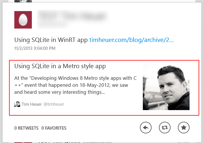
Looking at the results, I’m happy with my quick hack. Outside of the web site, the cards only show on Twitter official apps it seems. Here are some examples based on my site content. The red box is only there to illustrate what content is actually the card:

View on twitter.com when expanding ‘view summary’
View on Twitter for iOS when viewing full Tweet detail

View on Twitter for Windows
Simple metadata additions providing some more content beyond the 140 characters Twitter allows in the post itself. I chose to use my face in the image because my blog doesn’t associate a “poster” image per-post. If yours does, you should use that if available and change the twitter:image value as needed.
Summary
This didn’t take me long to implement and adds some additional value on to the content I post on Twitter (I hope). Again, this is optional for the user, they have to click “view summary” or view the Tweet in details view to see this, so there is no general feed noise here. I have found that it appears to cache the results per URL so there may be an issue if you change title/description on a post. I’ve found that my initial tests wouldn’t update the previous Cards I had which were just the blog summary data…that’s unfortunate, but now I know.
When I talked with @JeffSand he mentioned this would be nice to have the App cards for Windows Phone/Windows Store apps (ugh, we really have to do something about that name). I think this is a great idea! Unfortunately it looks like Twitter needs to do something to understand Windows apps as it only understands iOS/Google Play app stores. I’ve started a conversation with Jeff’s team as of the date of this writing and hopefully we can understand what might be required and deliver some goodness here.
If you are a content publisher (hint: if you are a blogger you are) this is a subtle and helpful addition to your content in my opinion. If you are podcaster, consider using the Player Card as well. It was really easy to understand and implement and I like the results.
Hope this helps!
Please enjoy some of these other recent posts...