Building a deployable custom control for XAML Metro style apps
| CommentsAt //build one of the surprising immediate things I heard about was folks wanting to build custom controls right away. I knew that would happen, but not so quick on something so new (WinRT). The XAML platform did not have good support for building custom controls in the Developer Preview but now that the Consumer Preview for Windows 8 and Visual Studio 11 Beta are out, there is much better support. There are two key things when thinking about custom controls: 1) building it and 2) making it consumable by developers (even if those developers are your own company). I’ll try to articulate the methods of both here.
Defining custom versus user control
There is usually some debate in the XAML community about the definition of a custom control. For the purposes of this discussion I define a custom control as a control that provides a generic.xaml, can be styled/templated and is usually encapsulated in its own assembly which can then be distributed. A custom control can contain user controls, but generally speaking does not. A typical user control scenario is one that lives within your project and not meant to be consumed by anyone outside your project.
This definition is the same whether we are talking about C++, C# or Visual Basic. Everything below applies to all languages.
Creating the custom control
The fundamentals of a custom control are that it is a class and it provides it’s own template/style. This style/template definition usually lives in a file located at themes/generic.xaml. This is the same pattern that has existed in other XAML implementations like WPF, Silverlight and Windows Phone. The pattern is no different for Metro style apps in this regard.
The creation of the most basic custom control is very simple. A Windows SDK sample for XAML User and Custom Controls is available for you to download for the quick review and core concept. My intent here is to take that a step further for the end-to-end implementation if I were a control vendor. Let’s first create our control. For our purposes we will create a control that shows an Image and allows you to specify some Text for the label. The label, however, will be prepended with some text that comes from string resources.
In Visual Studio we will create a class library project first.
NOTE: You can create a C#/VB Class Library and keep it managed, or convert it to a WinRT component. You may also create this in C++ using the WinRT Component project type. Again, these concepts are the same, the syntax will be obviously slightly different for C++ and managed code.
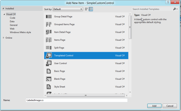
Once you create the class library (I called mine SimpleCustomControl and deleted the initial Class1.cs file that was created), add an item to the project. You can do this via right-clicking on the project and choosing add item. You will be presented with a few options, but the important one is Templated Control.

Watch was this does to your project as it will do 2 things:
- Create a new class
- Add a Themes folder and place a ResourceDictionary called generic.xaml in that folder
The themes/generic.xaml is very important if you use the DefaultStyleKey concept in your class. This is very much a convention-based approach. The contents of the class is very simple at this point, with the sole constructor and the DefaultStyleKey wired up:
1: namespace SimpleCustomControl
2: { 3: public sealed class LabeledImage : Control
4: { 5: public LabeledImage()
6: { 7: this.DefaultStyleKey = typeof(LabeledImage);
8: } 9: } 10: } This maps to the generic.xaml definition of our control. Let’s modify our ControlTemplate in generic.xaml to be a little more than just a border:
1: <Style TargetType="local:LabeledImage">
2: <Setter Property="Template">
3: <Setter.Value>
4: <ControlTemplate TargetType="local:LabeledImage">
5: <Border Background="LightBlue" BorderBrush="Black" BorderThickness="2"
6: HorizontalAlignment="Center" Width="140" Height="150">
7: <StackPanel HorizontalAlignment="Center">
8: <Image Stretch="Uniform" Width="100" Height="100"
9: Source="{TemplateBinding ImagePath}" Margin="5" />
10: <TextBlock TextAlignment="Center" FontFamily="Segoe UI" FontWeight="Light"
11: FontSize="26.667" Foreground="Black" x:Name="LabelHeader" />
12: <TextBlock TextAlignment="Center"
13: Text="{TemplateBinding Label}" FontFamily="Seqoe UI" FontWeight="Light"
14: FontSize="26.667" Foreground="Black" />
15: </StackPanel>
16: </Border>
17: </ControlTemplate>
18: </Setter.Value>
19: </Setter>
20: </Style>
Now we have a place for an Image, LabelHeader and a Label. Notice that we have {TemplatBinding} statements there. This is how the template binds (duh) to values provided to the control. So our ControlTemplate is expecting these properties to exist on our control. We will create these as DependencyProperty types so we can use them in Binding, change notification, etc. In Visual Studio we can make re-use out of the ‘propdp’ code snippet that exists for WPF. It is slightly different in the last argument, but it will definitely save you a lot of typing. We’ll create 2 DependencyProperties like this in our LabeledImage.cs file:
1: public ImageSource ImagePath
2: { 3: get { return (ImageSource)GetValue(ImagePathProperty); }
4: set { SetValue(ImagePathProperty, value); }
5: } 6: 7: public static readonly DependencyProperty ImagePathProperty =
8: DependencyProperty.Register("ImagePath", typeof(ImageSource), typeof(LabeledImage), new PropertyMetadata(null));
9: 10: public string Label
11: { 12: get { return (string)GetValue(LabelProperty); }
13: set { SetValue(LabelProperty, value); }
14: } 15: 16: public static readonly DependencyProperty LabelProperty =
17: DependencyProperty.Register("Label", typeof(string), typeof(LabeledImage), new PropertyMetadata(null));
We also had that LabelHeader property. This is going to be a value coming from a string resource that may be localized at some point. In our library add a folder called “en” and then within that, using the Add Item dialog in VS, add a Resources.resw file. Within that Resources.resw file add a name/value pair of name=LabelHeader.Text and value=This is an image of a… and you can save/close the file.
Now back to our class file we are going to set the value of our TextBlock by overriding our template rendering, grabbing a reference to that TextBlock and setting the value from our string resource.
1: protected override void OnApplyTemplate()
2: { 3: base.OnApplyTemplate();
4: 5: TextBlock tb = GetTemplateChild("LabelHeader") as TextBlock;
6: tb.Text = new ResourceLoader("SimpleCustomControl/Resources/LabelHeader").GetString("Text");
7: } Now, I’m showing this way, because it is pretty verbose and there is an easier way…but you wouldn’t know it is easier unless you saw the harder way right?
First it is important to understand how these resources are indexed. You’ll notice that I’m using a ResourceLoader class to map to what looks like {component}/{resw-file-name}/{property} which is effectively right. When you create a resw file, at compile-time these get built into a PRI file. This post isn’t about this whole resource loading process, but you should definitely understand this a bit. Basically for a control creator perspective you need to understand that your string resources (and file-based resources) live in a ResourceMap that is the name of your component.
NOTE: An easy way to look at this resource indexing is to use the makepri.exe tool installed with VS. From a VS command prompt navigate to your build output and you should see a resources.pri file. Call makepri.exe dump and you’ll get an XML representation of that file you can look at. Knowing that structure is very helpful.
I said there was an easier way to get that string though. First remove the OnApplyTemplate override completely…we don’t need it for this control anymore. Now in generic.xaml change the x:Name=”LabelHeader” to the following:
1: <Style TargetType="local:LabeledImage">
2: ... 3: <TextBlock TextAlignment="Center" FontFamily="Segoe UI" FontWeight="Light"
4: FontSize="26.667" Foreground="Black"
5: x:Uid="/SimpleCustomControl/Resources/LabelHeader" />
6: ... 7: </Style>
This will use the XAML parser way of getting the string resource (note the ResourceMap is still in the x:Uid value). Using the ResourceMap prefix is necessary when using this method as a custom control vendor.
We are done. Our control is complete.
Consuming the control from an application
We can quickly test our control by adding a new Metro style app to our project. Once we do this, make that the startup project and add a project reference to our control library. Then in the default page for our app (BlankPage or MainPage depending on your template choice), add an xmlns to the top and then consume the control:
1: <Page
2: x:Class="Application1.BlankPage"
3: xmlns="http://schemas.microsoft.com/winfx/2006/xaml/presentation"
4: xmlns:x="http://schemas.microsoft.com/winfx/2006/xaml"
5: xmlns:local="using:Application1"
6: xmlns:d="http://schemas.microsoft.com/expression/blend/2008"
7: xmlns:mc="http://schemas.openxmlformats.org/markup-compatibility/2006"
8: xmlns:controls="using:SimpleCustomControl"
9: mc:Ignorable="d">
10: 11: <Grid Background="{StaticResource ApplicationPageBackgroundBrush}">
12: <controls:LabeledImage ImagePath="Assets/110Orange.png" Label="Orange" />
13: </Grid>
14: </Page>
See how the ImagePath and Label are used here? In more advanced scenarios we can bind values from our view model or other ways. When rendered the control will show like this:

This is great…but also what we call a “project-to-project” (P2P) reference. As a control vendor we want to distribute our control, not our source primarily. So we need to package this up. There are two ways you can do this.
Package your control as an Extension SDK
One of the new methods for distributing Metro style controls in VS11 is via Extension SDKs, also sometimes referred to as non-Framework SDKs. Extension SDKs are machine-wide and available to all projects once installed. They can be distributed via the Visual Studio gallery and using the VSIX mechanism…which allows for update notification in Visual Studio. There are a few intricacies that you can configure your Extension SDK but for most it will get down to three things:
- Describing your SDK and what it supports
- Including the binary that projects need to reference
- Including any assets/files that the control relies on to render
In examining our sample above we have a few things that map to this:
- Describing – our sample is a C# custom control so it will only work with managed Metro style apps, we will need to describe this in our SDK
- Binary – we have one binary: SimpleCustomControl.dll
- Redistributables – we have a generic.xaml and a PRI file with our string resources
The last part (redist) probably is making some existing XAML control developers scratch their heads. Why isn’t the generic.xaml embedded is what you are likely asking yourself. In Metro style apps, XAML assets are not embedded but rather exist as “loose file” assets for your control. This is why it is critical for getting the distribution model correct so that the runtime knows where to get the definitions for everything.
NOTE: This is a default method. You can, of course, use other techniques to get your assets into your binary either via string constants, other embedding techniques, etc. In doing so, however, you will now be managing all those extractions yourself rather than being able to rely on the resource APIs for Metro style apps.
The first thing we want to do is understand the structure of an SDK. These live in %ProgramFiles%\Microsoft SDKs\Windows\v8.0\Extension SDKs directory on disk. Within there you will have your own folder, version and then the layout of your SDK, as described by your manifest. Here is what our manifest (SDKManifest.xml) would look like for our control:
1: <?xml version="1.0" encoding="utf-8" ?>
2: <FileList
3: DisplayName="Simple Custom Control"
4: ProductFamilyName="Simple Controls"
5: MinVSVersion="11.0"
6: MinToolsVersion="4.0"
7: CopyRedistToSubDirectory="SimpleCustomControl"
8: AppliesTo="WindowsAppContainer+WindowsXAML+Managed"
10: MoreInfo="http://timheuer.com/blog/">
11: <File Reference="SimpleCustomControl.dll">
12: <ContainsControls>True</ContainsControls>
13: </File>
14: </FileList>
We are describing the display information as well as some key data:
- Display data – the title that will show up in Add Reference
- CopyRedistToSubdirectory – this would be the name of your component
- AppliesTo – what I support; in this I’m saying managed, XAML, Metro style apps
- <File> – these are the files that describe components in my SDK (not their loose assets)
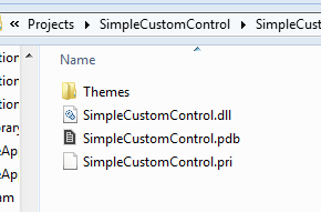
Now to create the structure. When you build the DLL your output will give you this:

We need to create the following structure that will live under the Extension SDK folder listed above:
%ProgramFiles%\Microsoft SDKs\Windows\v8.0\Extension SDKs\
--SimpleCustomControl
----1.0
------SDKManifest.xml (the file above)
------References\CommonConfiguration\neutral\SimpleCustomControl.dll
------Redist\CommonConfiguration\neutral\SimpleCustomControl.pri
------Redist\CommonConfiguration\neutral\Themes\generic.xaml
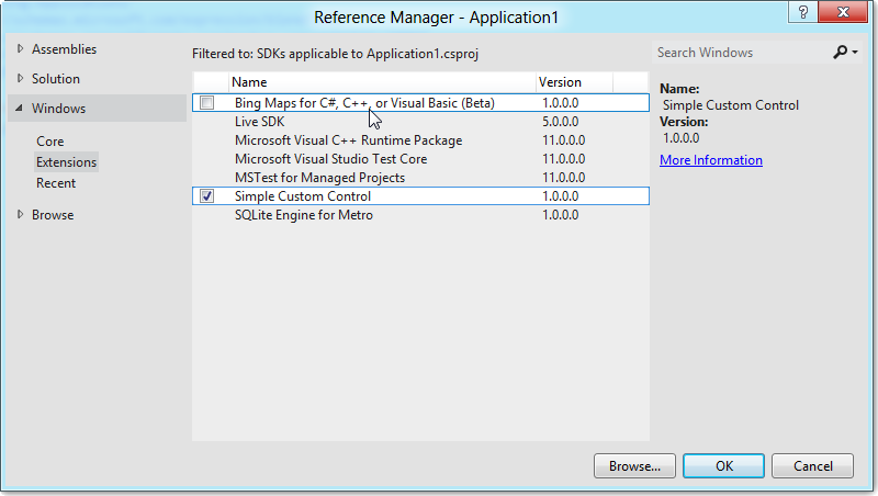
Notice the References and Redist folders. By placing these in that structure, the project will know what it needs to get type information (References) and then during running/deployment what it needs to package (Redist) and where it puts it (CopyRedistToSubdirectory). Put this layout in the directory and then when you choose add reference on a project you will see your option:

There are other configuration options for the SDKManifest that you can use and the required reading is the Extension SDK section in this MSDN article: How to: Create a Software Development Kit.
The next step for an Extension SDK is to really package it up nicely. You probably don’t want your users copy directories around all the time…and what about updates as well! Using the Visual Studio VSIX structure for this really makes it easy to do.
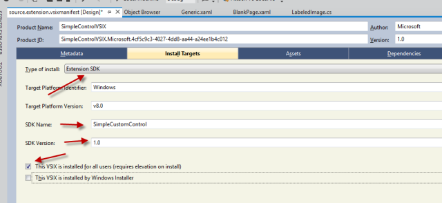
There are tools for Visual Studio to allow you to create a VSIX package. This requires the Visual Studio extensibility SDK to be installed and using Visual Studio professional or higher. Once you do that you can create a VSIX package and you will see the VSIX manifest designer. On the Install Targets tab you will choose Extension SDK:

We then re-create the layout structure in the VSIX project and add the Assets to the manifest. The result in the IDE looks something like this:

Now when we build we will get a VSIX installer that we can upload to the Visual Studio Gallery or distribute to our customers.
NOTE: Uploading the to Visual Studio Gallery has benefits in that once installed, any update you put in the gallery will provide notifications to the Visual Studio user than an update exists. This is done via the unique Product ID value in your manifest, so choose that value accordingly and don’t change it if you want this capability.
When a user gets the VSIX, they double-click it and see the installer:

And then they can use it as normally in Add Reference just like described above. Additional details on other VSIX deployment configurations can be found here: VSIX Deployment.
Once you have your VSIX you can upload to the Visual Studio Gallery and make it discoverable for users from within Visual Studio. Remember that this method of Extension SDK is machine-wide which is in contrast to the second method described next.
Package your control as a NuGet Package
The other option you have is to package up your control via a NuGet package. NuGet packages apply to the project and not the machine, but have the flexibility of not having to have anything installed and can travel their dependencies with the project. NuGet packages are another type of package that has a manifest that describes what the content does.
For Metro style XAML controls you will have to do a few things differently currently with the NuGet package you create. NuGet packages are based on nuspec files, which is basically a manifest describing where to get/put things in the package. You can also use the NuGet Package Explorer for a GUI way of reading/creating new packages. If you are unfamiliar with the nuspec format, using the package explorer will help you get a package created quickly.
NuGet is one area where there actually are current differences in C++ or managed code. Right now NuGet only supports managed code projects and not C++. I’m sure this may change in the future, but as of right now this applies only to managed code. For our control above here is what my nuspec file looks like:
1: <?xml version="1.0"?>
2: <package xmlns="http://schemas.microsoft.com/packaging/2010/07/nuspec.xsd">
3: <metadata>
4: <version>1.0.0</version>
5: <authors>Tim Heuer</authors>
6: <owners />
7: <id>SimpleCustomControl</id>
8: <title />
9: <requireLicenseAcceptance>false</requireLicenseAcceptance>
10: <description>A simple custom control for Metro style apps</description>
11: </metadata>
12: <files>
13: <file src="SimpleCustomControl\bin\Debug\Themes\Generic.xaml" target="lib\winrt\SimpleCustomControl\Themes\Generic.xaml" />
14: <file src="SimpleCustomControl\bin\Debug\SimpleCustomControl.dll" target="lib\winrt\SimpleCustomControl.dll" />
15: <file src="SimpleCustomControl\bin\Debug\SimpleCustomControl.pri" target="lib\winrt\SimpleCustomControl.pri" />
16: </files>
17: </package>
This assumes that the binaries being referenced here are all relative to the nuspec file. Notice how all the files go into the lib\winrt folder and that we essentially re-create that SDK layout in our package as well.
Now when I build this with nuget.exe I get a package output. In Visual Studio (with NuGet installed) I can now right-click on a project and choose Manage NuGet Packages and browse the library of packages. In testing out my package, I create a custom library (you do this via the Settings option when you are in the Manage NuGet Packages dialog) and just point it to the folder where my nupkg file was created:

When the package is selected, the reference is added to my project and during build, all the right pieces are put in my APPX package where they need to go. Once the reference is there I build and run my project and the control renders as expected!
What about the design-time experience?
All of the methods above will allow you to view your control on the XAML design surface in Visual Studio as well. In the Extension SDK method there is actually additional affordances for you to provide additional design-time assemblies/resources to make that experience even better. Custom control developers for XAML know about this .Design.dll that is created for their projects that can improve the design-time experience for UI controls. I highly encourage you to do that if you are creating a control that is for wide distribution and not just yourself or your small group of friends.
Summary
Wow this felt like a long post…thanks for reading this far! I think developing custom controls is a great way to encapsulate specific UI and behavior you want in your application. XAML has a great ecosystem of control vendors and I fully expect them to produce controls for Metro style apps as well. Hopefully these techniques of packaging them up for distribution will help us all take advantage of them.
I also think that creating an Extension SDK *and* a NuGet package are the best ways of thinking about it as a producer. This enables your consumers to have the greatest flexibility in how they want to consume your control. Creating these distribution mechanisms may seem cumbersome at first (and there are some places where Visual Studio can improve the experience of creating/managing these manifests), but once you understand the core layout that is required for a Metro style XAML control and the fact that you now have “loose files” to consider it really becomes pretty streamlined and you can automate the creation of these pretty quickly in your build systems.
Be sure to check out these resources again:
- Windows SDK: XAML User and Custom Controls (shows the C++ custom control as well)
- Creating a Software Development Kit (refer to Extension SDK section)
- NuGet Packages
- VSIX Deployment
Here is the solution for the project I walked through above: SimpleCustomControl.zip
Hope this helps!
Please enjoy some of these other recent posts...
Comments