Silverlight DataGrid quick styling tip: keep selected row focus state
A developer asked me this question and while a simple answer, I thought it would be a good quick tip to share for those who may be in similar situations.
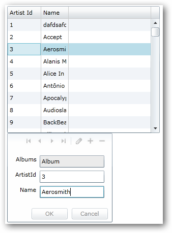
The scenario is the classic master-details scenario where perhaps you have a grid of data and when a user selects the row, the details are enabled in a form (or perhaps the child of the element) for editing. Maybe something like this:
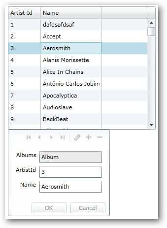
See you can see the row clearly selected (note: this is using the default DataGrid styling). But watch what happens when you go to the form to edit:
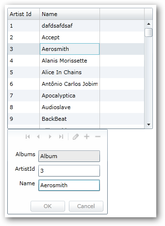
Notice the focus now on the TextBox in the form, and the row, while still ‘selected’ is much more subtle in which row is selected. The uninformed eye might miss which one. For some scenarios this might be important. Some might even think the row isn’t selected anymore since the visual state changed.
In fact it still *IS* selected and the only thing that changed *IS* the visual state…literally. Since Silverlight has the concept of the VisualStateManager, that is what we are seeing in action here. So you want to change that to make your desired UI as expected…having the row retain it’s selected look even when the user is editing. This is simple.
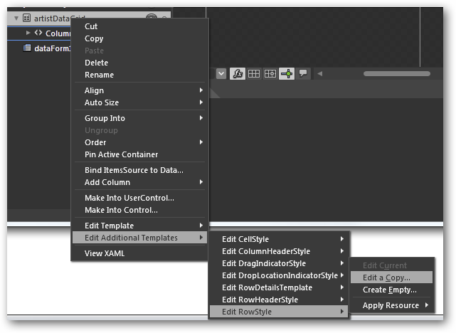
Using Expression Blend, you can select the DataGrid element and then choose Edit Additional Templates to find the RowStyle template to edit a copy of:
Once you have this, click the States tab in the tool and you’ll see the various visual states that a DataGridRow can have. Notice the NormalSelected and UnfocusedSelected states:
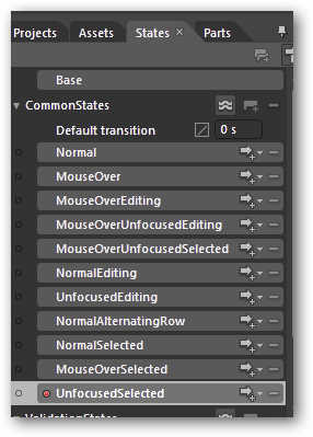
You would modify the Fill.Color property of the UnfocusedSelected state to accomplish the desired change. In this example, I just used the same color as the default grid for illustration. The end result is what the user may be expecting more. Notice the focus is on the TextBox in the form still, but the row still has a prominent selected color view:
A simple edit, but a helpful UI change to give your users more indication of what they are doing. Of course I’m just using the default styles of the DataGrid here, but you could use your own styles as well. Hope this helps!
Here is my style XAML as I completed the task above: StaySelectedStyle.txt
Please enjoy some of these other recent posts...