Using Silverlight for workflow creation
The other day I was given a peek at a company who implemented a full-frame Silverlight application that when I saw it it was one of those “wow” moments. A lot of the public-facing Silverlight examples are very different from one another and sometimes you see some that are full Silverlight applications that really give you a glimpse of how people are thinking about using the platform and how creative you can get. Colaab is one such example that I saw at PDC last year (check it out if you haven’t).
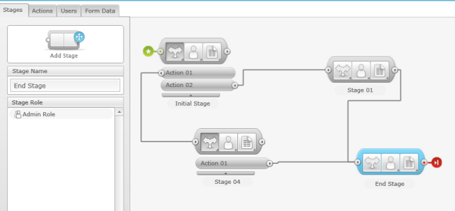
Another example is a recent one called SnapFlow. SnapFlow itself is a tool to really make creating workflows simpler to the end user. The way they have designed their product makes it easy to understand how to create a decision-driven workflow that can be exposed to your users (customers, employees, etc.). Essentially they separate the workflow into Stages, Actions and Data – all integrated into a user interface that if you are an Office user, you would have no problem understanding. The best part is…the entire user interface is Silverlight. Take a look at the screen below:

All of that design surface is Silverlight with full drag around behavior, connecting stages together in a visual, intuitive manner. The application is very responsive and incorporates a lot of features. I highly recommend you view the simple walk through video below for a view into all of the features…everything you see is Silverlight:
What is cool in one of the features is that once you, the creator of the workflow, are complete, you can then deploy that workflow into your web site or other portal (the demonstration shows using Sharepoint for example). So you could develop a workflow for gathering some data from your web site, and embed the generated Silverlight application on your site with absolutely no coding required on your part. Your employees will be able to act upon that workflow given the permissions assigned to them which then triggers the next part of the workflow (duh, it’s a workflow!) based on the action chosen.
It’s a convenient use of workflow, both simple and complex. I am really impressed with the use of Silvelright and how responsive and fluid the user experience is. I have walked through the application a few times and send my beta feedback on some things that I’ve seen from a general usability standpoint and the company was responsive.
The team at SnapFlow also put up a blog, where one of their first posts is: Why Silverlight? It is an interesting read from a customer standpoint demonstrating some of the pros/cons in their decision and use.
SnapFlow is in beta right now and you really can’t appreciate it just looking at a screen shot. Sign up for the beta and try it out yourself to see how they’ve used Silverlight to implement these types of usability features. It uses a lot: controls, user interaction (drag/drop), popup modals, data input/validation, connecting objects, etc. – it’s a great example. Sign up for the beta to play around with it.
Please enjoy some of these other recent posts...