why tafiti is important
- | Posted in
- silverlight
- user experience
- ux
- familyshow
- family.show
- vertigo
- tafiti
well, you've seen the flurry of tafiti no doubt (at least if you are a regular subscriber to things silverlight). i'm not here to say "go check it out" and add another post to the flurry, but instead to perhaps look at why tafiti is important.
you see, when i look at the site, i think it is cool, interesting, unique, <insert-favorite-word-here>. but at the same time i'm a little opinionated about the ui design choice. i should be clear that i'm no professional designer at all, and all of this is my opinion of course. but i look at the home page of tafiti and i see a lot of things going on and elements that i'm not sure interact with each other. there seems to be a theme of some type of desk/drawer. maybe i'm just not a fan of woodgrain :-). now because my mom is a librarian and i grew up singing family songs about the dewey decimal system (ah, good times), i can visually see that this drawer emulates a card catalog box (hence the single hole punch in the search box area), but are those elements matched with the other experiences? i feel like i'm looking at a card catalog sitting in an ocean scene.
perhaps i'm being too picky (and i'm sure i am). but one of the most unique features of tafiti is not being demonstrated in the user's face enough IMO and maybe should be a default view given this experimental project. that's the tree view i'm speaking of. what?! you haven't seen it? do a search and then in the top there is a link to "tree view" -- click it now.
and there in lies the importance to me of tafiti. a different experience on search. you see, the default search results are just that -- default. they give me a header and some initial text sorted (apparently in relevant order).
SIDENOTE: when i do a search in tafiti that is powered by live search (i thought) the search results are different then when i go to live.com. hmmm...
here's where i think rich internet applications (beyond rich media experiences) have a real opportunity to excel...different visualizations of data. why is that important? well, i'll take it from my perspective as not to assume i speak for the rest of the human race. for me, tafiti is good and there are some demonstrations of the platform of silverlight, etc. -- but for me at the end, it still is search. until you see the tree view. here's a look:

you see the tree view "grows" a tree out of the results (i'm still trying to understand the sort order, but for this purposes this is irrelevant). each branch becomes a result and sways in the wind in front of you. one could argue (i'll be that one) that this might not be the best demonstration of this visualization (because you want to see relevant data in searches displayed more prominently), but the point is that it is a different twist on an existing problem domain. i find myself going back and playing with the tree view for the silverlight aspects, but also to see if it does make some sense from a presentation sense for the results...either way it has kept me engaged on something that is old hat: search. and to me, that's where rich internet applications can excel.
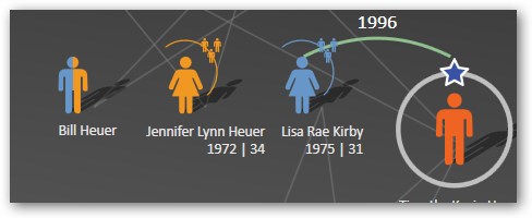
let's take another example using this same paradigm, family trees. i'm huge into genealogy. i've researched my family as far back as i can take it without digging out old documents in libraries that i don't have access too. my tool of organization for this has historically been personal ancestry file (affectionately referred to as PAF). for the most part, PAF is an excellent tool and gets the job done. pedigree charts can be rendered just like any other pedigree chart in every other online/offline application. then came mix07 and my friend scott stanfield and his team at vertigo. what did they do? they took a different look at an existing problem domain. the result? family.show. you see, they didn't re-invent genealogy nor the pedigree concept, but the provide me a new visualization of the information...keeping me engaged and wanting more as a user. take a look:

they are showing my family tree as real people, not flowchart lines. oh, and they give me instant clues as to what i'm looking at: the star is me, the line connecting my wife, the fact that we have children, my sister and the fact she has children. oh, and bill, my half brother -- they even provide a view on that challenge of representing multiple lineages that intersect. (note: i don't have a half brother, but added that here to show a point.) another cool feature vertigo added was the timeline snap. curious what the family tree looked like years before? move the timeline:

notice the grayed out areas -- they aren't gone, but filter out in the background showing what the pedigree looked like at any given time. sweet. family.show has provided a new experience on an existing problem domain. and in doing so has made it a rich experience, an engaging one, and one that gets me excited again about the topic.
so what's my point? who knows really :-) -- in a nutshell it is bravo vertigo and tafiti, for providing some unique differences on existing scenarios. thanks for helping me understand that "rich internet application" doesn't have to always mean "new idea" all the time.
Please enjoy some of these other recent posts...