XAML AppBar Button Styles for Windows 8
An old colleague of mine and now HTML extraordinaire, Adam Kinney, just recently posted on his spelunking of some styling in both WinJS and XAML runtimes with regard to icons/buttons to use in a Metro style app and the AppBar.
Adam has two posts:
- (WinJS) Windows 8 AppBarIcons enumerated and visualized
- (XAML) Windows 8 AppBarButtonStyles enumerated and visualized
Basically what these do is define a set of styles, both in CSS and XAML, that map back to unicode values in the Segoe UI Symbol font. This contains a set of glyphs that are well-suited for use within an AppBar. As an example in WinJS you would use:
1: <button data-win-control="WinJS.UI.AppBarCommand"
2: data-win-options="{icon:'back', label:'Back'}"><button>
And in XAML you would use:
1: <Button Style="{StaticResource PreviousAppBarButtonStyle}" />
One thing that Adam points out is that WinJS includes definitions for a LOT of styles while the included StandardStyles.xaml file (provided for you when you create a new project in Visual Studio) defines a much smaller subset. When determining what styles to include in the XAML set, we opted for choosing the most common rather than to bloat the ResourceDictionary with things you may not use.
NOTE: Even within the provided one, you should always make it a best practice to REMOVE styles/templates that you aren’t using so the parser doesn’t have to worry about them.
Adam also notes that he likes the style of defining the WinJS ones a bit better as he mentions the XAML syntax feels heavy. I commented on his blog that WinJS is doing a lot of work for him here that has already defined the style. If WinJS didn’t exist, surely it would be ‘heavy’ in defining them. I’m still not sure why the XAML one feels heavy (once you just assume that a definition has been made for you in the ResourceDictionary provided – especially when I look above, they basically both look the same…but I digress.
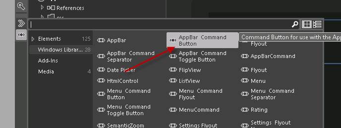
One thing that I wanted to point out was how the tools, Visual Studio and Blend, help make it way easy to choose and quickly visualize these styles on the design surface. For HTML/JS apps you need to use Blend for this as VS doesn’t support this feature at this time. When in Blend in your HTML/JS app you can open up the control palette and see a helper for AppBar Command Button:

And this produces a generic button definition much like above:
1: <button data-win-control="WinJS.UI.AppBarCommand"
2: data-win-options="{label:'Button', type:'button'}"></button>
What you can’t do from now (that I could see) is quickly pick from a set of those data-win-options to choose which one you want…so you still have to know what the definition is that you want for the icon/label. Let’s contrast that with the XAML experience with strongly-defined styles. In VS or Blend I can use the resource picker to pick from a set of styles that apply to my control type, in this case button:

I can quickly change and see the option on the design surface. Now again, if you don’t need all these styles, then please delete what you aren’t using from your ResourceDictionary.
It is great that we have design-time implementations of these styles and of course I’m partial to the XAML one as more familiar to me. Adam pointed out the discrepancy of not having all the styles defined. As I note, you shouldn’t have defined what you don’t need, but in the spirit of adding value, here’s an updated StandardStyles.zip with all the 150 icons defined.
Hope this helps!
Please enjoy some of these other recent posts...