Remote Debugging your Windows Store app on your Surface
- | Posted in
- xaml
- visual studio
- surface
- debugging
- windows 8
- winrt
- windows rt
- arm
- remote debugging
So you got that shiny new Surface device today? I’m sure you spent the first few hours just opening it up, setting your personal experiences to your desire, re-installing and discovering new apps.
But you are a developer and now you want to see how your app looks on this great device…Here are some tips to get you quickly started.
Setting up the tools
One thing to keep in mind is that Surface is NOT a full ‘desktop’ machine and runs on an ARM processor. This means to that you cannot install Visual Studio directly on the Surface RT device. You will need to still ensure that you have a full development environment set up. But the first thing you will need is to get the remote developer tools for Visual Studio *for your target remote device* architecture. For Surface RT, this is the ARM tools.
You can get them here: Microsoft Visual Studio Downloads. Scroll down a bit and look in the “Additional Software” section. Grab the Remote Tools for Visual Studio 2012 section.
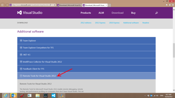
You can do this either from the desktop browser on the Surface or from your own desktop and download the remote tools for ARM to a USB key.
On your device, install the remote tools for ARM. No other Visual Studio installation is required here. Just run the installer. When completed you should have a tile on your screen for the tools:
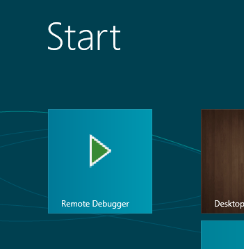
Now you can get started with your remote debug session!
Configuring the Remote Debugger
After install go ahead and launch the Remote Debugger on your device. You’ll be presented with (maybe after some firewall questions you need to authorize) the remote debugger now running and in default mode:
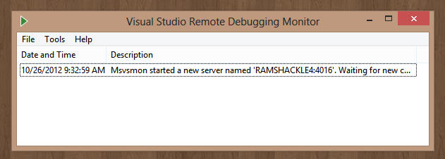
By default, it is set up secure. This means that in order to attach a remote session you’d need to ensure permissions are correct, etc. Now since your ARM device isn’t likely on the same domain/workgroup as your developer machine this may be tricky. Personally, I turn off the authentication options to make my developer experience smoother. Now of course, you shouldn’t leave your device in this state, but you can close the remote debugger when complete. Here is the config that I use on my remote debugger:
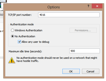
This allows me to just launch the app on the remote machine without having to use any special authentication tricks since the machine isn’t on my domain, etc. My remote environment is now set up and ready for me to launch an app and start debugging!
Launching an App on the remote debugger
Now that your remote device is configured and listening, you want to start your app and debug remotely. Once you have your app in Visual Studio you’ll want to change your launch target to “Remote Device” in the IDE. This is in the toolbar or in the project properties. For a C# application it looks like this:
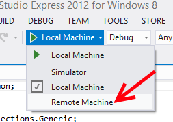
Once you launch that you’ll be able to select your device. Now if you are on your home network, with no domains and all on the same subnet, you may just be able to discover your device in the remote debugger connections window. However you can also just specify the machine name. Be sure to match the authentication method in this window with what you chose when you set up the remote debugger…in my case “none.”
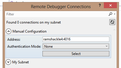
Now that the configuration is there (and selected), when I run (F5) the application it will attempt to deploy it on the remote device. When you run you’ll notice the remote debugger will show the connections:
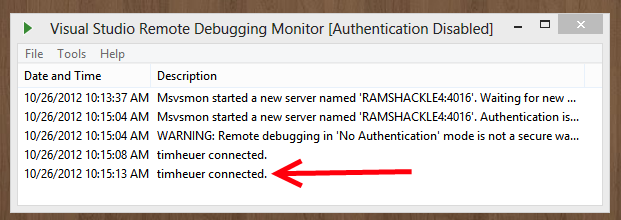
And in your developer workstation you’ll be able to set breakpoints, investigate watch parameters, etc. All the same stuff you normally do is still available to you.
Summary
Now that you have a Surface (or other Windows RT device) running on an ARM processor, this remote debugging toolset/workflow will be important to you. The great thing is that once it is set up and you understand the flow, it is very simple and seamless to use. This presents a great opportunity for you to debug and profile your apps on Windows RT to see any areas that you might be able to optimize for the target device. And all you need is Visual Studio Express for Windows 8 (free) and the Remote Debugger tools for Visual Studio 2012 (free)
Hope this helps!
