Well, the official Windows Phone Developer Tools are out!  Go get them. (warning likely some caching issues..direct installer here.)

The awesome Silverlight toolkit team is at it again, this time for Windows Phone 7.  The team is releasing a series of controls/libraries to help WP7 developers fill some gaps and simply make things easier and more consistent.  The initial set includes the following:

These controls are available for download including the source code.  Here’s a quick synopsis of them for you to enjoy.  Note that the “toolkit” prefix on the controls is declared in the app as:

   1: xmlns:toolkit="clr-namespace:Microsoft.Phone.Controls;assembly=Microsoft.Phone.Controls.Toolkit" 
   2: xmlns:toolkitPrimitives="clr-namespace:Microsoft.Phone.Controls.Primitives;assembly=Microsoft.Phone.Controls.Toolkit"

after adding a reference to the Microsoft.Phone.Controls.Toolkit assembly.

ContextMenu

In WP7 there is a notion of a context menu, where when the user holds down an item (tap and hold) it pops up a menu in-line with some options.  This is used in areas like the application list, where if you tap and hold an application you get the option to pin it to the start menu, uninstall, etc.  For the toolkit control this is implemented as a ContextMenu service.  For example, if I wanted to enable a context menu on my canvas I would use this markup:

   1: <Canvas HorizontalAlignment="Left" VerticalAlignment="Top" Width="345" Height="91" Margin="0,50,0,0">
   2:     <toolkit:ContextMenuService.ContextMenu>
   3:         <toolkit:ContextMenu>
   4:             <toolkit:MenuItem Header="pin to start menu" Click="OnMenuClicked" Tag="START_MENU" />
   5:             <toolkit:MenuItem Header="delete" Click="OnMenuClicked" Tag="DELETE" />
   6:             <toolkit:MenuItem Header="share" Click="OnMenuClicked" Tag="SHARE" />
   7:         </toolkit:ContextMenu>
   8:     </toolkit:ContextMenuService.ContextMenu>
   9:     <Rectangle Fill="#FFF4F4F5" Height="91" Stroke="Black" Width="345"/>
  10:     <TextBlock TextWrapping="Wrap" Text="Tap and Hold (zoom)" Foreground="Black" Canvas.Left="71" Canvas.Top="27"/>
  11: </Canvas>

And the result would look like:

ContextMenu control

There is an option to disable ‘zoom’ of the context menu, which follows the UI consistency of the device itself and is the default.  Additionally you could implement the actual command using ICommand on the particular item.

DatePicker and TimePicker

These are two controls I’ve seen attempted to create to mimic the actual device controls in the WP7 OS itself.  Some implementations have been better than others.  Here the UI is matched with the semantics of the device.  When using the control, it will automatically provide you with a TextBox input and when the user selects it, the picker will display.  The markup is very simple:

   1: <toolkit:DatePicker />

to produce the user experience when the user clicks on the input area:

WP7 Toolkit pickers

While shown above is the DatePicker, the TimePicker operates in similar fashion.

For the pickers you may notice that in my screenshot above I have the checkmark and the “x” icons in the ApplicationBar.  If you didn’t read the code comments in the toolkit you likely have “x” icon placeholders and are wondering why.  The toolkit provides the necessary icons for these, but you have to bring them into your application.  Once installed, look for them in the SDK folder and then add them using this well-known path:

WP7 toolkit icon layout

Once you have the PNG files there, be sure to mark them as Content so they are included correctly and then you should be good!

ToggleSwitch

If you notice areas in WP7 that have simple on/off settings you may want to provide a consistent look in your application.  The ToggleSwitch control does just that, providing not only the actual ToggleButton, but also the area for label/etc.  This area could be templated as well so if you needed more than just a single text heading listing.  The code:

   1: <toolkit:ToggleSwitch Header="my setting name" Height="118" Margin="0,0,-24,-34" Width="480"/>

and the resulting UI:

ToggleSwitch control

GestureHelper

Wish you had a library that made it easier to know when a ‘flick’ or ‘pinch’ gesture happened?  Enter GestureHelper.  Using this on elements like this:

   1: <Image x:Name="GesturedImage" Source="dividbyzero.jpg" HorizontalAlignment="Center" VerticalAlignment="Center" Width="450" 
   2:     RenderTransformOrigin="0.5,0.5">
   3:     <Image.RenderTransform>
   4:         <ScaleTransform x:Name="ImageScaling" ScaleX="1" ScaleY="1" />
   5:     </Image.RenderTransform>
   6:     <toolkit:GestureService.GestureListener>
   7:         <toolkit:GestureListener PinchDelta="OnPinchDelta" />
   8:     </toolkit:GestureService.GestureListener>
   9: </Image>

enables you to respond to these events when they happen and react accordingly:

   1: private void OnPinchDelta(object sender, PinchGestureEventArgs e)
   2: {
   3:     ImageScaling.ScaleX = e.DistanceRatio;
   4:     ImageScaling.ScaleY = e.DistanceRatio;
   5: }

Very helpful library!!  NOTE: the above sample is actually not goot ‘pinch’ scaling for an image, but merely here to demonstrate a quick point.

WrapPanel

The WrapPanel has been specifically ported for WP7.  Using the similar syntax:

   1: <toolkit:WrapPanel Orientation="Horizontal">
   2:     <Rectangle Fill="Blue" Width="100" Height="100" Stroke="Black" />
   3:     <Rectangle Fill="Red" Width="100" Height="100" Stroke="Black" />
   4:     <Rectangle Fill="Green" Width="100" Height="100" Stroke="Black" />
   5:     <Rectangle Fill="Gray" Width="100" Height="100" Stroke="Black" />
   6:     <Rectangle Fill="Yellow" Width="100" Height="100" Stroke="Black" />
   7:     <Rectangle Fill="Orange" Width="100" Height="100" Stroke="Black" />
   8:     <Rectangle Fill="Teal" Width="100" Height="100" Stroke="Black" />
   9:     <Rectangle Fill="White" Width="100" Height="100" Stroke="Black" />
  10:     <Rectangle Fill="Pink" Width="100" Height="100" Stroke="Black" />
  11:     <Rectangle Fill="Magenta" Width="100" Height="100" Stroke="Black" />
  12: </toolkit:WrapPanel>

would produce the elements within the WrapPanel to be placed accordingly for you:
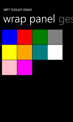
WP7 Toolkit WrapPanel

This will be helpful especially in areas of displaying items in storage locations (i.e., pictures, album art) I think.

Summary

These controls are being made available for you to freely consume in your applications.  Go to the Silverlight Toolkit site right now and download the Silverlight for Windows Phone Toolkit and begin incorporating them into your applications today.  Be sure to leave feedback on the Codeplex site with any issues you may find with your scenarios.

Be sure to visit the Silverlight Toolkit site for the bits and also ensure you subscribe to Jeff Wilcox and David Anson’s blogs for what likely will follow more detailed and useful information about the toolkit items!

Hope this helps!

Seesmic logoToday, Seesmic more broadly launched Seesmic Desktop, a refreshed platform for interacting with various social media outlets like Twitter, Facebook, Google Buzz, etc.  Seesmic has been one of the leaders in this space providing client applications on various platforms across web, desktop and mobile and providing us with unified views of our interaction with others online.

You may have remembered seeing Loic on stage at MIX last year demonstrating their first preview of this updated platform and inviting developers to be a part of extending the shell.  That’s right…their platform is extensible!  A great application that I can also modify to my needs?  Double rainbow…what does it mean!?

I went to the evening social session at MIX to hear about how they would be enabling developers to extend the platform.  In introducing the concept of plugins, it was made clear that the Seesmic Desktop Platform (SDP) would be leveraging the Managed Extensibility Framework (MEF) that was to be included as a part of Silverlight.  Seesmic would define MEF contracts that as long as developers adhered to them (and of course implemented any required interfaces for actual functionality) then the plugin would be able to extend the platform.  The most grandiose idea can be simply stated as if you don’t like how Twitter is represented in Seesmic, fine…change it.  Of course, I suspect most people will be just fine with their implementation and choose to extend in other areas as I’ve done.

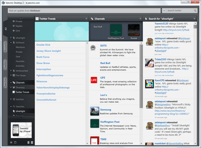
Seesmic Desktop 2

Admittedly I’ve got a vested interest in being excited about SDP…after all it is built using Silverlight.  However, I’m also very much into being a part of my online connected network via Twitter.  Prior to SDP I did not use Tweetdeck or some of the other popular multi-column ones…but was a user of Twhirl.  I loved the simplicity that it provided but did desire for slightly more.  I never got into Tweetdeck and honestly I don’t know why…it just never stuck to me in how I interacted online.  The thought of customizing my own experience, however, is what intrigued me to SDP.

I immediately got started writing some plugins, starting with something that I use often, a translator for reading messages incoming that aren’t in my native English.  Some may scoff, but when you monitor a lot of different things online, this becomes important as I don’t want to ignore things that might be interesting.  I chose to use Microsoft Translator services and in a few hours had my first rough draft plugin completed.  It was very rough (mostly because I desired a lot of things from Seesmic).  I showed Marco my warez and started to give feedback on what I think the platform needed for this specific use case as well as to make my life easier. 

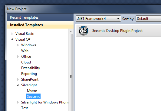
Since then the platform has significantly evolved to accommodate most developers needs.  Seesmic has been very responsive on the developer forums for the platform to needs and questions.  Getting started writing a plugin couldn’t be easier for a Silverlight developer, but I’ve tried to make it even simpler (as I was sick of doing the same tasks myself).  I created some templates that you can download from the Visual Studio gallery that will help get you started.  Once installed you’ll see a nice new project template in Visual Studio:

Seesmic project template

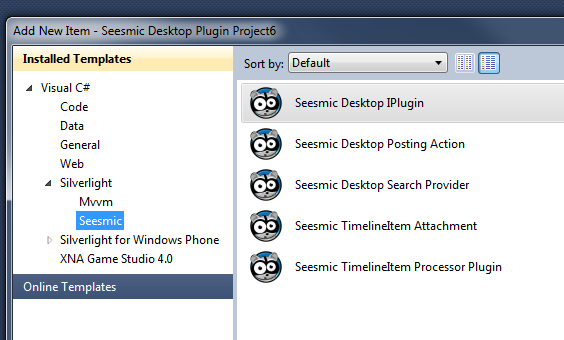
This will stub out the initial shell you will need (you’ll still need to add the correct references to the SDP SDK).  From there you can add item templates for the base plugin type or other types: posting actions, timeline items, etc.  Here’s what my templates provide:

Seesmic item templates

These should give you some good jumpstart code to provide some of the necessary plumbing that would be required.  This is NOT a substitute from understanding the platform!  You need to read the docs and understand the interaction of the API with the platform to be successful.

TIP: When you add references to the Seesmic SDK assemblies, change their Copy Local attribute (in properties) to false so you don’t end up shipping them with your plugin.  Since they are already a part of the platform there is no reason to ship them with your plugin (and this makes your plugin size smaller).

To me, I think the easiest plugins to create are those that implement a URL shortener, posting action or a timeline processor.  These are the areas which would allow for very fast customization.  The account providers is likely the most time consuming as you could imagine as you are interacting with authentication schemes, etc. 

I’ve created a few initial plugins that you might be interested in and you can download them here.  I’m really excited about this platform and the fact that I can extend it to make my interaction with things I care about uniquely my own.  Install Seesmic Desktop today and start developing using the SDK!

After a longer-than-should-have-been delay (you can blame me for that) allow me to introduce JetPack.

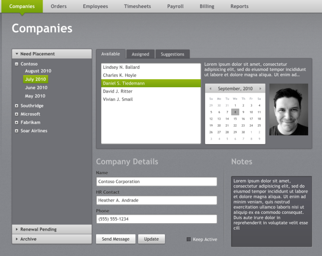
JetPack theme

I’m really excited about this theme and the work that our team put together here.  You may have see Tsitsi talk about theming in general and introduce this theme on Silverlight TV.  The challenge behind this theme was to take some of the excitement around other Silverlight themes and create a great looking overall theme that could be used for line-of-business applications, but also extended as desired by any other application.

Working with the team at Pixel Lab, our small team looked at areas of inspiration from various online and client applications that are popular and what worked well about the user interaction on those themes.  Robby and team did a great job in my opinion of creating a very well designed theme that can be used in almost any circumstance.

During this September refresh of the themes we’ve also updated the previous 3 themes: Cosmopolitan, Windows and Accent Color with some minor fixes and tweaks based on some feedback we got.  You can see a preview of the various styles in JetPack here.

We hope you enjoy JetPack as much as we do!  We’ve provided the theme pack in the same way as we have the others, as templates for Visual Studio 2010 and Expression Blend 4 and the raw assets (resource dictionaries) for you to download.  Each Visual Studio template is build for modeling the Silverlight Navigation Application template and the WCF Ria Services Business Application template.  We’ve provided the VSIX installer formats so you just need to download that, double-click and you’ll have them in your File…New Project window for selection.

Thanks for your patience through the release of JetPack, there were some moving parts in the end (mostly delays in our release management system which underwent some changes) that were human-caused [blame me] but we’re glad to finally get it out in the wild!  Download all the themes here.

Hope this helps!

September is here (apologies for being late - in all honesty I wasn't inspired by this months' selections)…time for an updated Windows 7 Smashing Magazine theme pack!

Smashing Magazine September 2010 Windows 7 Theme

The September themes seem to be continuing the focus on 'summer' things.  So here is your September 2010 Windows 7 Theme Packs for wallpapers – unfiltered and uncensored – about 75 wallpapers in all.

For details on these and to see past ones, visit the Smashing Magazine Windows 7 Theme information for the specifications I used for the theme pack as well as previous themes.  Want to participate and submit yours?  Join in!

The Silverlight team today posted some information about what the future holds for rich Internet apps and where we have come with SIlverlight, where we see HTML5 playing a role and how Silverlight will be a part of the future of this next evolution of rich Internet apps.

Brad Becker, Director of Product Management, provides some information behind the value of Silverlight in a world where HTML5 will also co-exist:

Expect to see more from Silverlight in these areas especially in our focus scenarios of high-quality media experiences, consumer apps and games, and business apps.

When you invest in learning Silverlight, you get the ability to do any kind of development from business to entertainment across screens from browser to mobile to living room, for fun, profit, or both. And best of all, you can start today and target the 600,000,000 desktops and devices that have Silverlight installed.

I would encourage you to go and read “The Future of Silverlight” (frankly which I think should be titled The Future Includes Silverlight) as it provides some good information about what exists today, capabilities of platforms and where these technologies can grow into in the future.  Be sure to leave comments for Brad on the post as well!