WPF Toolkit and Silverlight compatibility
- | Posted in
- silverlight
- wpf
- xaml
- vsm
- visualstatemanager
- datepicker
- calendar wpf toolkit
At PDC the WPF Tookit was made available which provides several new controls to WPF to help bring even more compatibility to the WPF and Silverlight story. The new controls were the DatePicker, Calendar, DataGrid and the VisualStateManager concept to WPF. Ribbon controls were also provided to the WPF Toolkit, but are not covered here.
With the introduction of this toolkit, developers now have a way to get some even more common XAML code-base between projects.
Let’s take a look at a very simple example of both UI and code sharing with WPF and Silverlight. Here’s the simple scenario. I’m going to use a common “Customer” class that I want to use in both a WPF and Silverlight implementation. Since there is no binary compatibility for Silverlight and WPF, I’m going to maintain source-level compatibility. In order to do this, I’m going to create a Silverlight Class Library project and implement my Customer class in that…here’s my simple customer class:
1: namespace SilverlightClassLibrary1
2: { 3: public class Customer
4: { 5: public string FirstName { get; set; }
6: public string LastName { get; set; }
7: public int CustomerId { get; set; }
8: public string CustomerLevel { get; set; }
9: public DateTime Birthdate { get; set; }
10: 11: public static ObservableCollection<Customer> GetCustomerData()
12: { 13: ObservableCollection<Customer> ppl = new ObservableCollection<Customer>();
14: 15: ppl.Add(new Customer() { FirstName = "Tim", LastName = "Heuer", CustomerId = 1, CustomerLevel = "Platinum", Birthdate = Convert.ToDateTime("9/18/1965") });
16: ppl.Add(new Customer() { FirstName = "Ray", LastName = "Ozzie", CustomerId = 1, CustomerLevel = "Gold", Birthdate = Convert.ToDateTime("1/12/1960") });
17: ppl.Add(new Customer() { FirstName = "Bill", LastName = "Gates", CustomerId = 1, CustomerLevel = "Silver", Birthdate = Convert.ToDateTime("12/1/1976") });
18: ppl.Add(new Customer() { FirstName = "Bart", LastName = "Simpson", CustomerId = 1, CustomerLevel = "Tin", Birthdate = Convert.ToDateTime("7/4/1985") });
19: 20: return ppl;
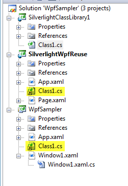
21: } 22: } 23: } Now in my Silverlight project and my WPF application I add a linked file to that class library for customer. While not binary compat, each time I compile I’m using a common source compat for both projects. Here’s what my project structure looks like and you can see the linked source code:
Now in my WPF project I want to add some XAML, so I’ll add this to my Window1.xaml:
1: <Window x:Class="WpfSampler.Window1"
2: xmlns="http://schemas.microsoft.com/winfx/2006/xaml/presentation"
3: xmlns:x="http://schemas.microsoft.com/winfx/2006/xaml"
4: xmlns:controls="clr-namespace:Microsoft.Windows.Controls;assembly=WPFToolkit"
5: Title="Window1" Height="600" Width="600">
6: <Grid>
7: <StackPanel Orientation="Vertical" Margin="15">
8: <TextBlock Text="Your Birthdate" />
9: <controls:DatePicker x:Name="MyBirthdate" Text="9/18/1965" />
10: <controls:DataGrid Height="400" x:Name="CustomerList"/>
11: </StackPanel>
12: </Grid>
13: </Window>
Here’s the backing source code logic for the simple windows app:
1: namespace WpfSampler
2: { 3: /// <summary>
4: /// Interaction logic for Window1.xaml
5: /// </summary>
6: public partial class Window1 : Window
7: { 8: public Window1()
9: { 10: InitializeComponent(); 11: Loaded += new RoutedEventHandler(Window1_Loaded);
12: } 13: 14: void Window1_Loaded(object sender, RoutedEventArgs e)
15: { 16: CustomerList.ItemsSource = SilverlightClassLibrary1.Customer.GetCustomerData(); 17: } 18: } 19: } Now in my Silverlight project I’m going to paste the same XAML:
1: <UserControl x:Class="SilverlightWpfReuse.Page"
2: xmlns="http://schemas.microsoft.com/winfx/2006/xaml/presentation"
3: xmlns:x="http://schemas.microsoft.com/winfx/2006/xaml"
4: xmlns:controls="clr-namespace:System.Windows.Controls;assembly=System.Windows.Controls"
5: xmlns:data="clr-namespace:System.Windows.Controls;assembly=System.Windows.Controls.Data"
6: Width="600" Height="600">
7: <Grid x:Name="LayoutRoot" Background="White">
8: <StackPanel Orientation="Vertical" Margin="15">
9: <TextBlock Text="Your Birthdate" />
10: <controls:DatePicker x:Name="MyBirthdate" Text="9/18/1965" />
11: <data:DataGrid Height="400" x:Name="CustomerList"/>
12: </StackPanel>
13: </Grid>
14: </UserControl>
and here’s the Silverlight source code logic as well:
1: namespace SilverlightWpfReuse
2: { 3: public partial class Page : UserControl
4: { 5: public Page()
6: { 7: InitializeComponent(); 8: Loaded += new RoutedEventHandler(Page_Loaded);
9: } 10: 11: void Page_Loaded(object sender, RoutedEventArgs e)
12: { 13: CustomerList.ItemsSource = SilverlightClassLibrary1.Customer.GetCustomerData(); 14: } 15: } 16: } So if you have a keen eye you’ll see it’s not full cut/paste as you note the xmlns declarations in the root control. Since the implementations are in two different assemblies (System.Windows.Controls.dll for Silverlight and Microsoft.Windows.Controls.dll for WPF Toolkit) we have to make sure they are referenced accordingly. We can still use the same prefix though of “controls” so that we have greater re-use across our XAML. For DataGrid, we need to do an additional step since for Silverlight it is on its own assembly.
If we run these applications here is what we get:
WPF Application:

Silverlight application:

Sure we had to do some maneuvering (xmlns stuff) but if you have some great XAML/code you can still get some good re-use out of those implementations with little effort and share code!
So what about VisualStateManager? How do you use that in WPF if you already have something in Silverlight? Let’s simplify it to the most common/basic control – Button. Using Blend we’ve styled a simple Button control and Blend has generated the appropriate VSM resources for us (note that I am not a designer and just used Blend to quickly make 2 changes that probably look horrible :-):
1: <Style x:Key="StyledButton" TargetType="Button">
2: <Setter Property="Background" Value="#FF1F3B53"/>
3: <Setter Property="Foreground" Value="#FF000000"/>
4: <Setter Property="Padding" Value="3"/>
5: <Setter Property="BorderThickness" Value="1"/>
6: <Setter Property="BorderBrush">
7: <Setter.Value>
8: <LinearGradientBrush EndPoint="0.5,1" StartPoint="0.5,0">
9: <GradientStop Color="#FFA3AEB9" Offset="0"/>
10: <GradientStop Color="#FF8399A9" Offset="0.375"/>
11: <GradientStop Color="#FF718597" Offset="0.375"/>
12: <GradientStop Color="#FF617584" Offset="1"/>
13: </LinearGradientBrush>
14: </Setter.Value>
15: </Setter>
16: <Setter Property="Template">
17: <Setter.Value>
18: <ControlTemplate TargetType="Button">
19: <Grid>
20: <vsm:VisualStateManager.VisualStateGroups>
21: <vsm:VisualStateGroup x:Name="CommonStates">
22: <vsm:VisualState x:Name="Normal"/>
23: <vsm:VisualState x:Name="MouseOver">
24: <Storyboard>
25: <DoubleAnimationUsingKeyFrames Storyboard.TargetName="BackgroundAnimation" Storyboard.TargetProperty="Opacity">
26: <SplineDoubleKeyFrame KeyTime="0" Value="1"/>
27: </DoubleAnimationUsingKeyFrames>
28: <ColorAnimationUsingKeyFrames Storyboard.TargetName="BackgroundGradient" Storyboard.TargetProperty="(Rectangle.Fill).(GradientBrush.GradientStops)[1].(GradientStop.Color)">
29: <SplineColorKeyFrame KeyTime="0" Value="#F2FFFFFF"/>
30: </ColorAnimationUsingKeyFrames>
31: <ColorAnimationUsingKeyFrames Storyboard.TargetName="BackgroundGradient" Storyboard.TargetProperty="(Rectangle.Fill).(GradientBrush.GradientStops)[2].(GradientStop.Color)">
32: <SplineColorKeyFrame KeyTime="0" Value="#CCFFFFFF"/>
33: </ColorAnimationUsingKeyFrames>
34: <ColorAnimationUsingKeyFrames Storyboard.TargetName="BackgroundGradient" Storyboard.TargetProperty="(Rectangle.Fill).(GradientBrush.GradientStops)[3].(GradientStop.Color)">
35: <SplineColorKeyFrame KeyTime="0" Value="#7FE61212"/>
36: </ColorAnimationUsingKeyFrames>
37: <ColorAnimationUsingKeyFrames BeginTime="00:00:00" Duration="00:00:00.0010000" Storyboard.TargetName="Background" Storyboard.TargetProperty="(Border.Background).(SolidColorBrush.Color)">
38: <SplineColorKeyFrame KeyTime="00:00:00" Value="#FFEE4B4B"/>
39: </ColorAnimationUsingKeyFrames>
40: </Storyboard>
41: </vsm:VisualState>
42: <vsm:VisualState x:Name="Pressed">
43: <Storyboard>
44: <ColorAnimationUsingKeyFrames Storyboard.TargetName="Background" Storyboard.TargetProperty="(Border.Background).(SolidColorBrush.Color)">
45: <SplineColorKeyFrame KeyTime="0" Value="#FFF40B0B"/>
46: </ColorAnimationUsingKeyFrames>
47: <DoubleAnimationUsingKeyFrames Storyboard.TargetName="BackgroundAnimation" Storyboard.TargetProperty="Opacity">
48: <SplineDoubleKeyFrame KeyTime="0" Value="1"/>
49: </DoubleAnimationUsingKeyFrames>
50: <ColorAnimationUsingKeyFrames Storyboard.TargetName="BackgroundGradient" Storyboard.TargetProperty="(Rectangle.Fill).(GradientBrush.GradientStops)[0].(GradientStop.Color)">
51: <SplineColorKeyFrame KeyTime="0" Value="#D8FFFFFF"/>
52: </ColorAnimationUsingKeyFrames>
53: <ColorAnimationUsingKeyFrames Storyboard.TargetName="BackgroundGradient" Storyboard.TargetProperty="(Rectangle.Fill).(GradientBrush.GradientStops)[1].(GradientStop.Color)">
54: <SplineColorKeyFrame KeyTime="0" Value="#C6FFFFFF"/>
55: </ColorAnimationUsingKeyFrames>
56: <ColorAnimationUsingKeyFrames Storyboard.TargetName="BackgroundGradient" Storyboard.TargetProperty="(Rectangle.Fill).(GradientBrush.GradientStops)[2].(GradientStop.Color)">
57: <SplineColorKeyFrame KeyTime="0" Value="#8CFFFFFF"/>
58: </ColorAnimationUsingKeyFrames>
59: <ColorAnimationUsingKeyFrames Storyboard.TargetName="BackgroundGradient" Storyboard.TargetProperty="(Rectangle.Fill).(GradientBrush.GradientStops)[3].(GradientStop.Color)">
60: <SplineColorKeyFrame KeyTime="0" Value="#3FFFFFFF"/>
61: </ColorAnimationUsingKeyFrames>
62: </Storyboard>
63: </vsm:VisualState>
64: <vsm:VisualState x:Name="Disabled">
65: <Storyboard>
66: <DoubleAnimationUsingKeyFrames Storyboard.TargetName="DisabledVisualElement" Storyboard.TargetProperty="Opacity">
67: <SplineDoubleKeyFrame KeyTime="0" Value=".55"/>
68: </DoubleAnimationUsingKeyFrames>
69: </Storyboard>
70: </vsm:VisualState>
71: </vsm:VisualStateGroup>
72: <vsm:VisualStateGroup x:Name="FocusStates">
73: <vsm:VisualState x:Name="Focused">
74: <Storyboard>
75: <DoubleAnimationUsingKeyFrames Storyboard.TargetName="FocusVisualElement" Storyboard.TargetProperty="Opacity">
76: <SplineDoubleKeyFrame KeyTime="0" Value="1"/>
77: </DoubleAnimationUsingKeyFrames>
78: </Storyboard>
79: </vsm:VisualState>
80: <vsm:VisualState x:Name="Unfocused"/>
81: </vsm:VisualStateGroup>
82: </vsm:VisualStateManager.VisualStateGroups>
83: <Border x:Name="Background" Background="White" BorderBrush="{TemplateBinding BorderBrush}" BorderThickness="{TemplateBinding BorderThickness}" CornerRadius="3">
84: <Grid Margin="1" Background="{TemplateBinding Background}">
85: <Border x:Name="BackgroundAnimation" Opacity="0" Background="#FF448DCA"/>
86: <Rectangle x:Name="BackgroundGradient">
87: <Rectangle.Fill>
88: <LinearGradientBrush EndPoint=".7,1" StartPoint=".7,0">
89: <GradientStop Color="#FFFFFFFF" Offset="0"/>
90: <GradientStop Color="#F9FFFFFF" Offset="0.375"/>
91: <GradientStop Color="#E5FFFFFF" Offset="0.625"/>
92: <GradientStop Color="#C6FFFFFF" Offset="1"/>
93: </LinearGradientBrush>
94: </Rectangle.Fill>
95: </Rectangle>
96: </Grid>
97: </Border>
98: <ContentPresenter HorizontalAlignment="{TemplateBinding HorizontalContentAlignment}" Margin="{TemplateBinding Padding}" x:Name="contentPresenter" VerticalAlignment="{TemplateBinding VerticalContentAlignment}" Content="{TemplateBinding Content}" ContentTemplate="{TemplateBinding ContentTemplate}"/>
99: <Rectangle x:Name="DisabledVisualElement" IsHitTestVisible="false" Opacity="0" Fill="#FFFFFFFF" RadiusX="3" RadiusY="3"/>
100: <Rectangle Margin="1" x:Name="FocusVisualElement" IsHitTestVisible="false" Opacity="0" Stroke="#FF6DBDD1" StrokeThickness="1" RadiusX="2" RadiusY="2"/>
101: </Grid>
102: </ControlTemplate>
103: </Setter.Value>
104: </Setter>
105: </Style>
There is nothing more we have to do in Silverlight since VSM is a part of the core. We just annotate our Button with the style:
1: <Button Content="Styled Button" Style="{StaticResource StyledButton}" />
Now in WPF we can use those same resources by adding them to our Grid.Resources node in our Window1.xaml file. The thing is that we don’t need the vsm: prefix. A simple find/replace removes them and we have our style button. The resulting full XAML for the style looks the exact same (minus any vsm: prefix) and the XAML for the button also looks the same.
I think there has to be a better way to use linked files here as well, so I’ll think about that and report back if I find one. I know this is a very simple demonstration of only a bit beyond Hello World, but I hope at least it gets you thinking of how you can get source-level compatibility and some XAML re-use out of your Silverlight and WPF applications.
What are your thoughts? Have you found better ways? What are the stumbling blocks you are facing in code sharing?
 So on to the resolutions. First, I added authentication.

