If you’ve created a Windows 8 app using XAML then you’ve likely seen a file in the project called StandardStyles.xaml in the Common folder and merged in with your application.  As I’ve seen apps developed I’ve seen people pretty much treat this as a system component and not change it at all.  Sometimes that’s good, but mostly it has been bad.  There are a lot of apps that I’ve seen that don’t use a lot of the styles in that dictionary, but don’t do anything to trim the file or even remove it if not needed.

The file was included in Windows 8 Visual Studio project templates to help style some areas of the template.  In looking at performance in Windows 8.1 we saw that people were not removing this file or unused styles in this file.  We also saw that there was benefit to including some of these styles in the framework because of some styles/template deferred loading we implemented in Windows 8.1.  As such for almost all apps we’ve seen in practice, the styles provided in Windows 8/VS2012’s StandardStyles.xaml file can be removed from your application and replaced with styles in the XAML framework.

Text Styles

A big portion of the file is providing some text styles that map to the typographic ramp for the Windows design language.  Roughly 100 lines of text styling can now be migrated to new framework-provided text styles.  Here’s a mapping of what you should examine replacing with in your Windows 8.1 app:

StandardStyles.xaml (in VS 2012) Windows 8.1 XAML Framework-provided name
BasicTextStyle BaseTextBlockStyle
BaselineTextStyle n/a (merged with BaseTextBlockStyle)
HeaderTextStyle HeaderTextBlockStyle
SubheaderTextStyle SubheaderTextBlockStyle
TitleTextStyle TitleTextBlockStyle
SubtitleTextStyle SubtitleTextBlockStyle
BodyTextStyle BodyTextBlockStyle
CaptionTextStyle CaptionTextBlockStyle
BaseRichTextStyle BaseRichTextBlockStyle
BaselineRichTextStyle n/a (merged with BaseRichTextBlockStyle)
BodyRichTextStyle BodyRichTextBlockStyle
ItemRichTextStyle n/a (was same as BodyRichTextBlockStyle)


The replacement is pretty simple as wherever you were using {StaticResource SomeTextStyle} you would now change to {StaticResource FrameworkProvidedStyle} (obviously using the correct names).  As with anything, when making these changes test your app to ensure your UI fidelity remains as you expect.  Should you need to continue to style some of the above, you could use these as your BasedOn starting point.

Button Styles

Another area was a series of Button styles around Back button, TextBlock buttons and the most used AppBarButton styles.  TextButtonStyle is now TextBlockButtonStyle and serves as a styled Button for areas like GridView clickable section headers, etc. 

There were also a few Back button styles.  With the introduction of AppBarButton in Windows 8.1, we can provide a better/specific template style provided in the framework with the right glyphs for the arrows.  Instead of using the BackButtonStyle/SnappedBackButtonStyle in StandardStyles.xaml you should use NavigationBackButtonNormalStyle and NavigationBackButtonSmallStyle.  The normal style is the main one that you would use on pages and is the 41x41px standard back button.  The small style is the 30x30px smaller button that you might use for a narrow (formerly snapped) view or other areas.

Perhaps one of the most used areas were the AppBarButton styles.  There is roughly 1100 lines of styling for a series of button styles for the various popular glyphs of AppBar button styles.  We are now providing a typed button that is optimized for that UI and we now have included 190 icon types as a part of the base.  As an example this is what you might have had in your Windows 8 app:

<Button Style="{StaticResource PlayAppBarButtonStyle}" />

And can now be replaced with:

<AppBarButton Icon="Play" Label="Play" />

This reduces the need for the base AppBarButtonStyle as well as the others that were glyph-specific.  If you need them to be RTL specific, just add the FlowDirection property as you need it for your app.  The Label property will map directly through to the AutomationProperties.Name value by default as well for the accessibility needs.

List/Grid Item Templates/Styles

In the Grid/Split templates there were also style item templates for the use in the pages within these templates.  In looking where they were actually used, these were moved to only the pages that need them.  Many people think that your styles/templates must be in App.xaml, but this is not true and most of the time not a good performance decision.  If your style is only used in one page, put it in the resources of that page!  That is what was done with these specific styles for the VS 2013 project templates.  Some were removed in accordance with new guidance around app sizes as well.

Using Visual Studio 2013 for Styling

You may ask yourself now how you would use this or know about them or even remember them!  Luckily Visual Studio 2013 added some great new features in the tools to bring more visibility to these styles.  The resource pane is still there and would show the framework-provided styles as seen here in Blend:

System Resource style selection image

If you are an editor-only person, there is still great news as VS added Style IntelliSense!!!  As you use StaticResource you will get auto-completion on the styles that apply to that style you are on.  For example on TextBlock you will only see Styles that apply to TargetType=TextBlock as seen here:
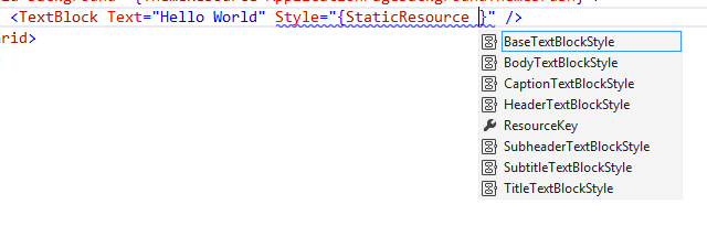
VS Style IntelliSense image

This IntelliSense will work with your own custom styles as well and is a great productivity enhancement to the tools.  This one of my favorite new features of VS!

If you want to see the details of these styles you can use the great template-editing features in Visual Studio/Blend to inspect them as well.  Once you have the style you can now also F12 (Go to definition) on the Style itself!!!!  This will take you to the definition of the style in the framework’s generic.xaml:
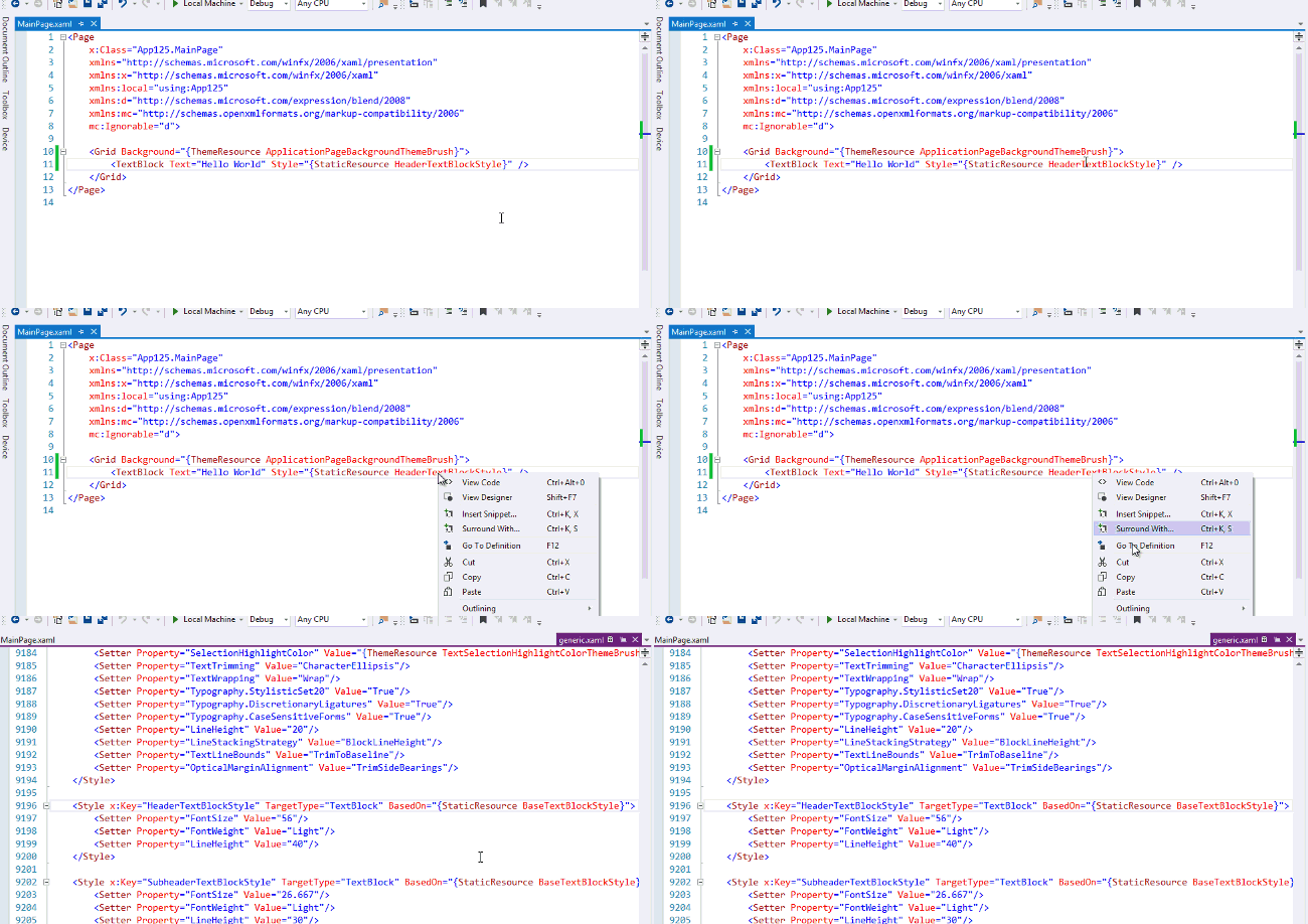
Style Go to definition example

This is an amazing productivity feature that is available for all Styles in XAML, again including your own!  These styles can be manually inspected by looking at the generic.xaml that ships in the Windows SDK (location %programfiles%\Windows Kits\8.1\Include\WinRT\XAML\Design).

Summary

One of our main goals was continue to improve overall app performance for Windows 8.1 for all users.  This optimization of bringing most commonly used styles into the framework benefits developers for consistency and productivity as well as all users for shared use of these templates and reduced load/parse time for each individual app needing to provide some of these core styles.

Hope this helps!

I’m continuing in my series of helping to provide Callisto migration tips to use new Windows 8.1 features. In a recent post I talked about the Flyout control and provided the path to the platform-provided features. In Callisto, the Menu control was provided as sort of a prescribed content for the Flyout control. In fact you really couldn’t use Menu without Flyout.

Menu control sample image

This guide will help you change to the platform-provided MenuFlyout now available in Windows 8.1.

API Differences

On the public surface area, there aren’t actually many changes here. Windows 8.1 MenuFlyout provides more functionality as it derives from FlyoutBase, which is the base for Flyout as well. So you get the same ShowAttachedFlyout capability that you have there. Both have an Items property that is a collection of the menu items you’d put in there. For these purposes I’m not detailing out the minutiae of differences between FlyoutBase and Menu here as it isn’t relevant to migration but is useful later as I’ll demonstrate. The main reason is that as I noted earlier, you actually can’t use Menu in Callisto without using Flyout, hence the lack of a significant delta here at the Menu level.

Change to the MenuFlyout

As with the other examples, I’m going to use the Callisto test app code here to show migration. Since Menu needed Flyout, you had more of a code-focused approach in ideal Callisto usage. We believe that the main use cases for Menus are also in Button invoke scenarios. Here’s an example of showing a Menu in Callisto:

private void ShowFlyoutMenu(object sender, RoutedEventArgs e)
{
    Callisto.Controls.Flyout f = new Callisto.Controls.Flyout();
    f.PlacementTarget = sender as UIElement;
    f.Placement = PlacementMode.Top;
    f.Closed += (x, y) =>
    {
        LogEvent("Event: Closed");
    };
 
    Menu menu = new Menu();
 
    MenuItem mi = new MenuItem();
    mi.Tag = "Easy";
    mi.Tapped += ItemClicked;
    mi.Text = "Easy Game";
    mi.MenuTextMargin = new Thickness(28, 10, 28, 12);
 
    MenuItem mi2 = new MenuItem();
    mi2.Text = "Medium Game";
    mi2.Tag = "Medium";
    mi2.Tapped += ItemClicked;
    mi2.MenuTextMargin = new Thickness(28, 10, 28, 12);
 
    ToggleMenuItem tmi = new ToggleMenuItem();
    tmi.Text = "Enable Logging";
    tmi.IsChecked = chk;
    tmi.Tapped += (a, b) =>
        {
            chk = !chk;
        };
 
    menu.Items.Add(mi);
    menu.Items.Add(mi2);
    menu.Items.Add(new MenuItemSeparator());
    menu.Items.Add(new MenuItem() { Text = "Foobar something really long", Tag = "Long menu option", MenuTextMargin = new Thickness(28,10,28,12) });
    menu.Items.Add(tmi);
 
    f.HostMargin = new Thickness(0); // on menu flyouts set HostMargin to 0
    f.Content = menu;
    f.IsOpen = true;
}

You will have to understand some of the events and variables are examples here (LogEvent and chk). Notice how you have to create a Flyout first, then put the Menu in it with all the items. Here is how you would migrate that code to provide immediate migration to the platform control:

private void ShowMenuFlyout3(object sender, RoutedEventArgs e)
{
    MenuFlyout mf = new MenuFlyout();
    MenuFlyout.SetAttachedFlyout(sender as FrameworkElement, mf);
    mf.Closed += (x, y) =>
        {
            LogEvent("Event: Closed");
        };
 
    MenuFlyoutItem mi = new MenuFlyoutItem();
    mi.Tag = "Easy";
    mi.Tapped += ItemClicked;
    mi.Text = "Easy Game";
 
    MenuFlyoutItem mi2 = new MenuFlyoutItem();
    mi2.Text = "Medium Game";
    mi2.Tag = "Medium";
    mi2.Tapped += ItemClicked;
 
    ToggleMenuFlyoutItem tmi = new ToggleMenuFlyoutItem();
    tmi.Text = "Enable Logging";
    tmi.IsChecked = chk;
    tmi.Tapped += (a, b) =>
        {
            chk = !chk;
        };
 
    mf.Items.Add(mi);
    mf.Items.Add(mi2);
    mf.Items.Add(new MenuFlyoutSeparator());
    mf.Items.Add(tmi);
 
    MenuFlyout.ShowAttachedFlyout(sender as FrameworkElement);
}

Now notice how the shape of the items is similar so helping with some migration. You create a MenuFlyout, MenuFlyoutItems (notice the separator and ToggleMenuFlyoutItem), then add them to the MenuFlyout and show it. But just like Flyout in Windows 8.1 we believe there was an easier way we could provide creating and using MenuFlyout.

A better way to use MenuFlyout

Much like Flyout we believe the primary use case for MenuFlyout will be from ButtonBase invocations. Let’s look at the declarative approach to the code above:

<AppBarButton Icon="Add" Label="New Game">
     <AppBarButton.Flyout>
         <MenuFlyout>
             <MenuFlyoutItem Tag="Easy" Text="Easy Game" Tapped="ItemClicked" />
             <MenuFlyoutItem Tag="Medium" Text="Medium Game" Tapped="ItemClicked" />
             <MenuFlyoutSeparator />
             <ToggleMenuFlyoutItem Text="Enable Logging" IsChecked="True" />
         </MenuFlyout>
     </AppBarButton.Flyout>
 </AppBarButton>

This allows us to provide an automatic way to show the menu when the button is clicked. If we aren’t using a Button we can still use the Set/ShowAttachedFlyout method as demonstrated above.

Summary

Moving to the new MenuFlyout control will again gain you better performance, compliance with UI guidelines, declarative model and accessibility features. As you can see there is a short-term migration approach using the the ShowAttachedFlyout method to allow you to very quickly take advantage of the new control if you were using the Callisto code method. Your app can then decide if it makes sense to move to the declarative model. Either way, the new control is great and you should use it! We also have a Windows 8.1 MenuFlyout SDK Sample that you can examine to play around with the API.

Hope this helps!

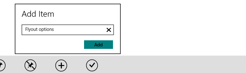
This is another post in my series of providing migration tips from certain Callisto controls to using Windows 8.1 features. I previously demonstrated probably the most popular Callisto control, the SettingsFlyout. Coming in a very close second in popularity is the Flyout control. The Flyout is a concept of a non-modal small dialog for information and commands.

Flyout sample image

The primary use case for a lot of Flyouts was something from Button areas, namely the AppBar. Getting the experience right was not intuitively easy using a Popup primitive as you had to handle the right UI guidelines for animation, positioning and dismiss logic. Callisto provided most of this in the Flyout class but also left some people wanting a bit more flexibility. This post will aim to help you migrate existing Callisto Flyout code to the new Windows 8.1 Flyout class.

API Differences

As I did with showing some of the more prominent API differences in SettingsFlyout, I’m presenting some of the important differences for Flyout here. You should read this table as Callisto API==old, Windows 8.1 API==new and what you should use.

Callisto API Windows 8.1 API Comments
HorizontalOffset/VerticalOffset n/a Not really needed in almost all default cases. If you really needed to adjust the default logic, you could provide a template for FlyoutPresenter and change the margin there.
HostMargin n/a Not needed
HostPopup n/a Not needed
IsOpen ShowAttachedFlyout See explanation below
Placement Placement Same concept, different enum
PlacementTarget ShowAttachedFlyout See explanation below
Closed Closed
n/a Opened New event
n/a Opening New event

Changing your code – an example

Similar to previous examples, I’m going to use the Callisto test app examples here. Flyout in Callisto was another control that didn’t work well in markup. This section will show how you would change your existing code if you were using the Callisto method to use the new Flyout in Windows 8.1. After this section I’ll explain a better way to do this for most cases and the preferred way to use the control. However again I want to provide a “least code change” mechanism to migrate and will do so here.

In Callisto, you most likely wrote code to trigger opening a Flyout. Here’s an example taken from the test app (this was from a Button click event):

private void ShowFlyoutMenu2(object sender, RoutedEventArgs e)
{
    Callisto.Controls.Flyout f = new Callisto.Controls.Flyout();
 
    // content code removed for brevity
    // assume "b" variable here represents a visual tree or a user control
    f.Content = b;
 
    f.Placement = PlacementMode.Top;
    f.PlacementTarget = sender as UIElement;
    
    f.IsOpen = true;
}

The code here basically requires you to wire this up in an event handler and provide the UIElement as the PlacementTarget so it knows where to position the Flyout.

To change this here is what it would look like in Windows 8.1:

private void ShowFlyoutMenu2(object sender, RoutedEventArgs e)
{
    Flyout f = new Flyout();
 
    // again for brevity sake assume "b" here represents content
    f.Content = b;
 
    Flyout.SetAttachedFlyout(sender as FrameworkElement, f);
    Flyout.ShowAttachedFlyout(sender as FrameworkElement);
}

The key here is the SetAttachedFlyout/ShowAttachedFlyout method calls. You must first attach the Flyout to the FrameworkElement (again in this case this is on a Button). Then you show it. I’ve omitted the Placement here to allow for the new default (top) to occur. You could have also added Placement to the change as well. Placement will attempt to fit in this order: Top, Bottom, Left, Right.

The above is meant to demonstrate how to quickly change from Callisto code with minimal impact. The next section actually shows a preferred way of using the control and what a lot of Callisto users were actually asking for.

A better way to use Flyout

As demonstrated the Flyout can still be called from code after attaching it to a FrameworkElement. You are then responsible for calling the ShowAttachedFlyout method to open it. The Windows 8.1 Flyout was designed for the primary use case of ButtonBase elements and will automatically show for you when used in those cases. Let’s assume an example where I have a Button in my AppBar (btw, you should use the new AppBarButtons in Windows 8.1) and I want to show a Flyout when the user clicks on the button. I could do the event model above, but my MVVM friends are cringing a bit. Here’s an alternate and the most likely way you would use Flyout:

<AppBarButton Icon="Add" Label="Add File">
    <AppBarButton.Flyout>
        <Flyout>
            <!-- content here -->
        </Flyout>
    </AppBarButton.Flyout>
</AppBarButton>

As you can see here, on Button we’ve provided an attached property to put the Flyout element and its content. The framework will handle the showing of the Flyout when automatically attached to the Button like this. If you don’t want to use the Button method and perhaps you have to launch a Flyout from some other UIElement, you would use the ShowAttachedFlyout method as demonstrated above.

Summary

As one of the more popular controls this migration may take you down the quick route first and then give you more time to think about using the declarative way to really change later. I recommend using the new Flyout here as you will get all the proper behavior as well as better performance, accessibility and interaction with the software keyboard. We also have a new Windows 8.1 Flyout SDK Sample that walks through this usage and some other scenarios you can examine for your needs.

Hope this helps!

Continuing on my tips in migrating from Callisto for platform-supported Windows 8.1 APIs, I’ll cover another simple, but helpful text control in this post: WatermarkTextBox.

WatermarkTextBox sample image

When writing an app that provides input from customers, providing some “hint” when there is no text is a valuable thing to add. Here’s how to change to the platform-supported APIs.

Change back to TextBox

When using Callisto, you had to use a specific control that derived from TextBox. Simple enough:

<callisto:WatermarkTextBox Watermark="Enter some text..." />

In Windows 8.1 the concept of watermark text was added to controls for text input, including PasswordBox (one of the requests Callisto frequently got in this area). This support is added via the PlaceholderText property on these controls. The use is simple and to change from Callisto, simply move back to TextBox control and use the property:

<TextBox PlaceholderText="Enter some text..." />
<PasswordBox PlaceholderText="Enter your password" />

There are some subtle UI differences here in that the PlaceholderText in Windows 8.1 is not italic (something I personally prefer to better differentiate), but that’s about it. The same functionality of when it shows and doesn’t exists.

Summary

A quick change to your code will yield you yet another gain of removing a sub-classed control with it’s own template and take advantage of platform-supported text goodness and performance. Make the change my friends, make the change! Be sure to check out the other Callisto migration tips when moving your app to Windows 8.1!

Hope this helps!

Frankly I’m going to be honest and say I’m not sure why it took us so long to add this capability to TextBlock, especially given that the support in Callisto provided via DynamicTextBlock was originally done in Silverlight 2. O_O. Well, Robby can rest well now knowing that we no longer have to depend on his contributions to Callisto.

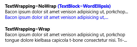
DynamicTextBlock sample image

Example of use DynamicTextBlock on bottom

Here’s the quick migration tip.

Change back to TextBlock

The DynamicTextBlock served one purpose, to provide trimming at the character level rather than the word level. The implementation of DynamicTextBlock was done using a ContentControl which, frankly, was probably too heavy handed for the usage here. However since TextBlock is sealed this was necessary. The usage for having this was simple:

<callisto:DynamicTextBlock Text="Some long text here" TextWrapping="NoWrap" />

And changing this to provide platform-supported trimming is simple as well:

<TextBlock Text="Some long text here" TextTrimming="CharacterEllipsis" />

Yep, that’s it.

Summary

This migration should be quick and painless. Using the platform’s TextBlock will allow you to benefit from the new typography settings provided in Windows 8.1 (like TextTrimming=”Clip” as well) in conjunction with this as well as better global text support. I’m thankful we were able to add this into the platform finally.

Hope this helps!