Yesterday, the Silverlight Live Streaming team (SLS) posted an update on their blog regarding the future of the Silverlight Streaming by Windows Live service.

SLS was a beta service to users to have a place to host and deliver their Silverlight-based applications or media to be delivered by Silverlight players.  It was launched at the time of Silverlight 2 as a free beta service to users under the Windows Live brand and offered 10GB of free storage to beta users.

In summary, the SLS service is being discontinued.  Effective immediately no new account sign-ups are going to be permitted for the service.  Existing accounts are not going to be deleted, nor is the content at this time.  A date for final termination of the service has not yet been set and the team has stated they will provide ample time to users to get their content out of the service.

Is there a replacement, if so, what is it?

A new Windows Azure based service for hosting and delivery of similar content is planned to be launched by the end of 2009 and would be a service that SLS users might consider transferring to, however is not a direct replacement of SLS.  Windows Azure is a broader initiative for the company and this is just one service that will be offered as a part of the suite of Azure cloud services.  Windows Azure is a pay service and will have costs associated with use.

How can I get my content?

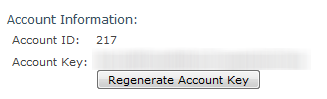
The SLS team blog post has information about how you can retrieve your content from the service.  In a nutshell, we’ve enabled the WebDAV folder support for users of the service.  This gives you the ability to map a drive to your account and move files in your file explorer utility.  The key pieces of information you will need to accomplish this is your SLS Account ID and Key.  These are different then your Live ID account you use to log into the service.  To retrieve these, log into your account at the SLS site and click on Manage Account in the SLS options on the left after logging in, like this:

SLS Account ID information

Make note of these two things.  The blog post has instructions on how you can use this information to map a network drive or network location to a WebDAV URL or share location to access your content.  I’m guessing the servers might be under some heavy load using this method so please be patient.  Remember that any authentication prompt is not looking for your Windows Live ID, but rather the SLS Account information noted above.

Summary and some FAQ

Yes, this is a bummer the service is going away as-is.  While the service was meant to stream any stand-alone Silverlight application, I know a lot primarily used it to host video content for blogs, etc. because of the web player it automatically generated. 

Q: Will the new Azure service enable video streaming and Smooth Streaming?
A: I think SLS had one of the most misleading names we’ve had on a product.  The video content on SLS was never really streaming in the technical sense.  It was always just a progressive download experience.  The Azure service details have not been completed for public detail just yet and will be announced when available as to what they will provide, costs and other details.

Q: What about the advertising platform?
A: Users who opted in and were approved for the advertising pilot with AdCenter will still have their AdCenter account information and content.

Q: When will you delete my content?
A: The final dates of discontinuance haven’t been determined and the team will give notice to all users (via the registered Windows Live ID account information/email and the blog) of timelines when they are available.  I would recommend to start downloading/saving your content now if you want it for later…this will save any mad rush to get content.

Hope this helps clarify anything but please also read the full announcement from the SLS team themselves.

If you’re a pro Silverlight developer, this post isn’t for you.  Just a brief update that I’ve updated some of our getting started material for beginners – those who really haven’t done anything.  These will be showing up on the Silverlight Community Site soon, but I wanted to post a link to it here first.

Getting Started with Silverlight Development is a 7-part series where I aim to do my best in trying to stuff as much as possible about Silverlight development in a simple application we develop at different steps.  It uses:

  • Navigation
  • Styles/templates
  • Data Templates
  • Data binding
  • Value Converters
  • Silverlight Toolkit controls
  • Isolated Storage
  • Network connectivity
  • Web service requests to a public service
  • Out-of-browser experiences

I hope that it is simple enough for beginners to follow but also provide a broad spectrum of capabilities to the beginner.  Full code in C# and Visual Basic is provided.

Hope this helps!

Over time a few people have contacted me about the missing WatermarkedTextbox from Scott Guthrie’s Digg sample for Silverlight he created a while back.  I had posted the updated code and binaries for WatermarkedTextbox here for you to use if you wish. 

NOTE: Incidentally this is the same code that is actually in the DateTimeTextBox that is included in the Silverlight Toolkit if you just want to use that :-).

After thinking about it though, I decided to take a stab at updating this getting started guide for new developers to Silverlight to incorporate some new features.  This isn’t for you folks that have already got your feet wet.  This is the Hello World –> have something complete in a few steps crowd.  Does it use Prism or MVVM?  No, not yet.  I think I wanted to keep simplicity to help people get started and then refactor from there.

Here’s the breakdown that I created (similar to Scott’s original flow):

I hope this helps some folks and refreshes our getting started content for the newbies!  I’m also going to try to refactor this simple application a few times to help learn the Model-View-ViewModel approach to XAML development so be sure to subscribe to my feed for updates.

This is a first part in a series of getting started posts for Silverlight developers. 

In our series in getting started, we’ll eventually build out an application that searches Twitter for monitoring keywords and automatically refreshes at a specified interval.  Before we start getting too deep, let’s make sure you have the tools necessary to get started and understand the fundamentals of the developer experience for Silverlight.

The Tools

Of course, with any development all you need is a text editor and a compiler, but you’d be crazy these days not to use world-class tools.  That being said, what I will propose here are a set of tools to make your complete development experience with Silverlight simpler and faster.  Not all are required (again, you just need notepad and a compiler if you are hard core :-)).  Not all are free either.  But I highly recommend them not just because I work at Microsoft, but I truly believe they are the best tools for the job.

Visual Studio 2008

You’ll want to make sure you have Visual Studio 2008 in your first bag of tricks.  You will need Service Pack 1 for VS installed to get the Silverlight tools, so make sure you have that.  Any version of Visual Studio 2008 SP1 will work with the tools.  If you do not have a copy of Visual Studio 2008, you can use one of the free express versions, Visual Web Developer Express 2008 to do Silverlight development.  If you plan on doing database development as well, you can get SQL Server 2008 Express as well for no cost.

Silverlight Tools for Visual Studio

The Silverlight Tools for Visual Studio is an additional download that installs the SDK, developer runtime (for debugging) and a set of tools for Visual Studio (project templates, build targets, etc.).  This one package installed on top of VS will get you everything you need for your VS development environment for Silverlight.

For both of these, Visual Studio and Silverlight Tools, you can download them separately.  If you already have VS, just download and install the Silverlight Tools and you will be up and running.  If you don’t have VS, consider using the Web Platform Installer which will install Visual Studio, SQL Server Express and the Silverlight Tools for you – without you having to hunt around for the installers.  You can get the Web Platform Installer here:

Web Platform Installer with Silverlight Tools

If you already have Visual Studio installed, you can still install the Silverlight Tools using WebPI or you can download them directly here.

Expression Blend

Expression Blend is an interactive developer tool.  It is a visual designer for XAML, the underlying presentation technology for Silverlight and Windows Presentation Foundation (WPF) applications.  It has a great design surface and allows for easy manipulation of layout, animations, styling and templating.  I believe this to be an essential tool in XAML development.  This tool, however, is not available at zero cost.  If you have an MSDN Subscription it is included in some levels.  It can also be purchased as a part of Expression Studio.  You can download an evaluation copy of Expression Blend 3 here to get started.  We will use Blend for layout in the next step.

Silverlight Toolkit

The Silverlight Toolkit is a set of additional controls that are available outside of the core control set.  These include charting controls, date/time controls, accordions and much more.  Best of all, the source code for these controls (as well as all the core controls) are included for you to learn from and extend!

The toolkit is available for download from CodePlex and we will be using some controls from it in this series.

There are other control suites and tools you can use like .NET RIA Services which we will discuss in step 3, but I think the above are my recommended minimum tools you should have for Silverlight development.  Install them all before proceeding in this tutorial in step 2.

Understanding the development environment

Once you install Visual Studio and the Silverlight Tools you will notice a new grouping in the VS New Project dialog box:

New Project Dialog Box

You will see some new templates under the category Silverlight which include at least Silverlight Application, Silverlight Class Library and Silverlight Navigation Application.  Some others you may see depending on additional tools you may have installed.

For this step, choose the Silverlight Navigation Application template and give it a name for the application (I’m calling mine TwitterSearchMonitor).

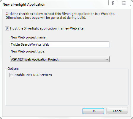
The next window you will see will ask you if you would like to create a web project:

New Silverlight Application Dialog Box

If this is a new project, I highly recommend choosing to create a web project for you.  By doing this you will have a web context to run the application for you.  This is helpful in avoiding issues around accessing web services from the local file system.  Running your application under HTTP from the start will help you avoid some of the most common mistakes in debugging web service access.  You can choose the ASP.NET Web Application Project, ASP.NET Web Site or ASP.NET MVC Project if you have that installed.  If you aren’t sure, just use the defaults.

The Project Structure

Once your app is created you will see something similar like this:

Silverlight project structure

This shows your web application (which will host the Silverlight application) with pre-created test pages for the Silverlight application and the Silverlight application itself.  Let’s focus first on the Silverlight application project.

There are some key files you should be aware of here that we’ll explore in this series:

  • App.xaml – this is an application-wide resource file.  If you put resources in here (we’ll explore in styling) or global events upon startup, they will happen here.  This file is also the entry point to your application and tells the Silverlight plugin what to do next.
  • MainPage.xaml – this is a page that is a part of the template you chose.  It doesn’t have to be called MainPage, but that is what the project template uses by default.  This represents the starting user interface for your application.  Don’t be confused by details just yet.
  • Assets/Views folders – these contain assets (files, images, styles, etc.) and other UI views for your application.

The XAML files are the files that make up the UI of your application.  They are just XML files with the XAML markup language.  We will be altering these in later steps.

When you build the solution (go ahead and do that) you’ll notice in the web application’s ClientBin folder a new file with a XAP extension will show up.  This is your compiled Silverlight application.  It’s actually an archive (aka ZIP) file with a different extension file name.  If you rename it to .ZIP and open it using an archive tool you can see the contents.

The XAP file is what is served to your browser.  This is the file that is hosted on the web server and gets delivered to the end user.  The XAP is hosted within a standard HTML page that hosts the Silverlight application using the <object> tag instantiation. 

NOTE: Silverlight is a client technology and can be hosted on any web server.  It can be any type of web server that is capable of delivering the XAP file along with the correct content MIME type from the server (application/x-silverlight-app).  As long as it does that, we don’t care what type of web server it is delivering the XAP file.

Test pages for ASP.NET and HTML are created for you with the standard template.  Since both of them are the same essentially, I usually delete one of them for simplicity.

Adding UI to the XAML pages

The template we chose is a navigation application template, meaning it has some navigation features built into it.  This is a fairly new feature to Silverlight and enables you to have a “master page” kind of view in your application.  If you look in the Views folder you will see About.xaml, ErrorWindow.xaml and Home.xaml.  For now let’s focus on Home.xaml since that is the first view that is loaded.  Open that file up by double-clicking it and you’ll see the XAML load in Visual Studio.

In this page you’ll see some XAML code that defines the view in a Grid that uses some other layout controls like a StackPanel and TextBlocks (we’ll go into StackPanel in the next step 2).  These are all part of the core control set that Silverlight provides.  A TextBlock enables you to present text to the user.  If you run the application now (hit F5 to run in debug mode – go ahead and choose to modify the web.config to enable debugging) you should see something like this:

Running Silverlight application

Notice the text in the running application matches the text in the TextBlock of the XAML.  Also notice the link style buttons in the upper right.  These represent our navigation points which go to our separate views.  Let’s add some more XAML and see how to write code.

In the Home.xaml view, after the second TextBlock, add a Button using this XAML:

   1: <Button Content="Click me" x:Name="MyButton" FontSize="18" Width="150" Height="45" />

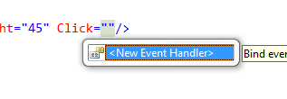
This will display a button on the view just underneath the “Home page content” text area.  Notice the x:Name attribute?  This is the unique identifier for this element and helps us reference it in code.  Think of this as the ID attribute of the control.  Now let’s make it do something when clicked.  There are two ways we can add events to the Button (or other elements) with simplicity.  In the XAML for Button itself we can add a Click attribute and you will see VS Intellisense automatically ask us if we want to generate a new event handler:

We can also wire up the event handler in code directly and keep it out of our XAML using this code in the Home.xaml.cs page:

   1: public Home()
   2: {
   3:     InitializeComponent();
   4:     MyButton.Click += new RoutedEventHandler(MyButton_Click);
   5: }

Either way will work.  For simplicity for now you can use whatever you like…I will use the XAML method for now.  Now in the function MyButton_Click we can write managed code in the function to manipulate our user interface or other functions.  Let’s finish our Hello World sample by changing the HeaderText TextBlock (HeaderText is the x:Name value so we can reference it easily in code) to “Hello World” output.  To do that we’ll write this function code:

   1: void MyButton_Click(object sender, RoutedEventArgs e)
   2: {
   3:     HeaderText.Text = "Hello World!";
   4: }

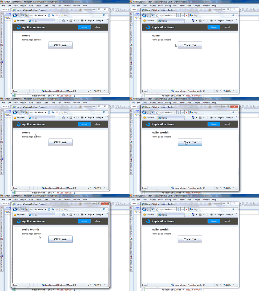
After making these changes and running the application again (F5) we will see our button and when clicked it will change the text like below:

finished product animation

Next Steps

We’ve created our first Hello World Silverlight application.  We’ve got more to do to complete our Twitter search application.  Let’s move to step 2 to change some of our layout of our views for our application.  For more information on getting started check out the other resources here:

We won’t provide the code download here because this was just to get us started.  Future steps we’ll include a link to the finished project always.  Hope this helps…let’s move on to part 2!

This is part 2 in a series on getting started with Silverlight.  To view the index to the series click hereYou can download the completed project files for this sample application in C# or Visual Basic.

Understanding layout management in XAML applications is an important aspect in being successful in Silverlight development.  For most coming from the web world, this will be one of the bigger challenges if you are not a CSS wizard.

Understanding Layout Options

Silverlight provides a flexible system for laying out UI elements on a surface.  There are layout models to support both a dynamic and absolute layout style.  There are several layout controls provided but the most commonly used will be:

  • Canvas
  • StackPanel
  • Grid

Let’s take a look at each of these using elements placed within them to see how they work.  We’ll use a simple Button element to demonstrate the purpose.  We’re using the same project we started with in step 1 and will show these on the Home.xaml page for simplicity (this is throw away code so just pick somewhere to play around for now).

Canvas

The Canvas is the most basic layout and would be used for positioning elements in an absolute manner using coordinates.  You position elements in the Canvas using Attached Properties. Attached properties allow the parent container (in this case Canvas) to extend the property of the controls within it (in our example Button).  We can position several buttons on a Canvas like this:

   1: <Canvas>
   2:     <Button Canvas.Top="50" Canvas.Left="50" Content="Button 1" FontSize="18" Width="150" Height="45" />
   3:     <Button Canvas.Top="150" Canvas.Left="20" Content="Button 2" FontSize="18" Width="150" Height="45" />
   4:     <Button Canvas.Top="70" Canvas.Left="80" Canvas.ZIndex="99" Content="Button 3" FontSize="18" Width="150" Height="45" />
   5: </Canvas>

and when rendered it would show something like this:

Canvas layout

As you can see, this is the absolute positioning approach to layout.  Notice in the code I can also specify an attached property for ZIndex which is why one Button is overlapping the other in this example.  This might be helpful in game development or high physics situations where the calculations are very specific.  Canvas is useful when things don’t move around much or you are pretty in control of the sizing of the application.  Otherwise, Canvas can sometimes be difficult to leverage in favor of things like StackPanel or Grid.

StackPanel

A StackPanel is a layout control which stacks the elements either vertically or horizontally (vertical by default).  Using the sample with 3 Buttons and this code:

   1: <StackPanel>
   2:     <Button Margin="10" Content="Button 1" FontSize="18" Width="150" Height="45" />
   3:     <Button Margin="10" Content="Button 2" FontSize="18" Width="150" Height="45" />
   4:     <Button Margin="10" Content="Button 3" FontSize="18" Width="150" Height="45" />
   5: </StackPanel>

the layout rendered would be:

StackPanel vertical

or if we change the default Orientation attribute to horizontal using this code (notice only difference is Orientation attribute on StackPanel):

   1: <StackPanel Orientation="Horizontal">
   2:     <Button Margin="10" Content="Button 1" FontSize="18" Width="150" Height="45" />
   3:     <Button Margin="10" Content="Button 2" FontSize="18" Width="150" Height="45" />
   4:     <Button Margin="10" Content="Button 3" FontSize="18" Width="150" Height="45" />
   5: </StackPanel>

it would render like:

StackPanel horizontal

StackPanel provides a simple way to layout elements on top of each other or alongside each other without much challenge of worrying about the positioning of the elements within this container.

Grid

Grid is going to usually be the most flexible layout for most scenarios (notice I said most, not all).  It is exactly what it sounds like, a Grid structure using rows and columns.  Unlike what web developers may be used to with the <table> element where the content is within the <tr>,<td> tags, the XAML Grid is different.  You define the overall structure of the Grid and then use attached properties to tell the elements where to place themselves.

Consider this code (notice I’m explicitly showing grid lines but that isn’t something you’d normally do generally…just showing here for better visualization):

   1: <Grid ShowGridLines="True">
   2:     <Grid.RowDefinitions>
   3:         <RowDefinition Height="60" />
   4:         <RowDefinition Height="60" />
   5:         <RowDefinition Height="60" />
   6:     </Grid.RowDefinitions>   
   7:     
   8:     <Grid.ColumnDefinitions>
   9:         <ColumnDefinition Width="175" />
  10:         <ColumnDefinition Width="175" />
  11:         <ColumnDefinition Width="175" />
  12:     </Grid.ColumnDefinitions>
  13:     
  14:     <Button Grid.Column="0" Grid.Row="0" Content="Button 1" FontSize="18" Width="150" Height="45" />
  15:     <Button Grid.Column="2" Grid.Row="0" Margin="10" Content="Button 2" FontSize="18" Width="150" Height="45" />
  16:     <Button Grid.Column="1" Grid.Row="2" Margin="10" Content="Button 3" FontSize="18" Width="150" Height="45" />
  17: </Grid>

We are defining the Grid to have 3 columns and 3 rows with specific width and heights.  Notice then in the Button elements we are positioning them in specific places within the Grid using the attached properties.  The resulting rendering looks like this:

Notice how the attached properties on the Button (Grid.Column, Grid.Row) tell the element where to position itself within the container.  Working with layouts is where Expression Blend can be extremely helpful.  Notice how in Blend you can use the guides to specify the column/row definitions visually and it will generate the XAML for you:
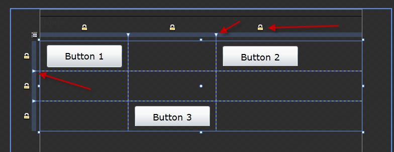
Grid in Blend

The arrows show you the guides as well as a visual indicator if the row/column are a fixed size (the lock).  We’ll use a combination of layout controls in our application.  In fact, the default template we chose makes use of all the different types of layout controls already for our basic shell for our application.

Building our Twitter Application

Now we can start building out our application.  In general, this is the mockup that we’ll be going after:

Twitter app mockup

Notice that we’ll have a place for the user to enter a search term, and the results will display in some list layout.  We’ll also have navigation areas to go to different views such as previous search term history and possibly some statistics.

Luckily the navigation template we chose already gives us some heavy lifting of our overall layout.  In MainPage.xaml I’m going to make a few changes.  On about line 29 in MainPage.xaml, I’m removing the application logo, and then changing the ApplicationnameTextBlock below it to “Twitter Search Monitor” for my application.

We’ll get back to navigation in a minute, but let’s recreate our Views.  In the project structure in the Views folder, create a new Page by right-clicking in Visual Studio and choosing to create a new Silverlight Page and name it Search.xaml:
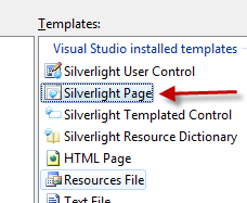
Add Silverlight Page dialog

Now you should have a blank XAML page with a default Grid layout.  This is where we’ll create the search screen seen above.  We get the header information from our MainPage.xaml because we are using a Frame element to host our navigation.

Silverlight Navigation Framework

At this point let’s take a tangent and understand the Silverlight navigation framework.  If you recall we started using the navigation application template.  The default template gave us MainPage.xaml and some views of Home, About.  The navigation framework is fundamentally made up of 3 parts: UriMapper, Frame and Page. 

UriMapper

I like to think of the UriMapper element as a routing engine of sorts.  It is not required by any means but I think obfuscates and simplifies your navigation endpoint.  Instead of exposing the literal /Views/Home.xaml URI endpoint, you can map that to a simpler “/Home” endpoint that is more readable and doesn’t give away and technical configuration…and can change later to map to something else.  You can see the UriMapper as an element of the Frame in MainPage.xaml:

   1: <navigation:Frame x:Name="ContentFrame" Style="{StaticResource ContentFrameStyle}" 
   2:                 Source="/Home" Navigated="ContentFrame_Navigated" 
   3:                 NavigationFailed="ContentFrame_NavigationFailed">
   4: <navigation:Frame.UriMapper>
   5:   <uriMapper:UriMapper>
   6:     <uriMapper:UriMapping Uri="" MappedUri="/Views/Home.xaml"/>
   7:     <uriMapper:UriMapping Uri="/{pageName}" MappedUri="/Views/{pageName}.xaml"/>
   8:   </uriMapper:UriMapper>
   9: </navigation:Frame.UriMapper>
  10: </navigation:Frame>

Now this UriMapper is in XAML like above, but it could also have been a resource and if done that way then you would add it to the Frame element like this (assuming the resource was UriMapperRoutes):

<code/>

We’ll stick to keeping what the template has provided us though at this time.

Frame

If you are an ASP.NET developer, you can think of the Frame element as like the ContentPlaceholder control.  The Frame is the area defined as the area that can be navigated.  You would specify a default view but then any navigation can occur within that area which we will see later.  Looking at the code above, you can see that the default view, the Source attribute of the Frame, is the “/Home” route for our application.

Page

The final fundamental area of navigation is the Page element, which we just created in our last step.  These are basically the content areas that are displayed in the Frame element.  They are very similar to the basic UserControl element that you might normally add (what MainPage is), but are special in that they can interact with navigation.  We will consider our Views in our application as our Page elements.

You can learn more about navigation specifically in this video walk-through:

It’s fairly simple to understand once you dig around in it and can be powerful to use.  This framework is what allows deep-linking into Silverlight applications to exist.

Creating the UI layout for our search view

Let’s finish creating the UI in our Search.xaml page we just created.  At this point you may be wondering what all the {StaticResource XXXXXXXX} elements are in the XAML.  We’ll get to that in the styling/templating section in step 5, so try not to let it bother you for now.

Looking at our mockup, we are going to need a text input area, button and data display grid.  Let’s start laying that out using Blend in our Search.xaml page.  To do this, from Visual Studio, right-click on the Search.xaml page and choose Edit in Expression Blend:

Open in Blend dialog

Since Blend and Visual Studio share the same project structures you will be able to open the file at the same time to do the visual editing of the XAML before we start coding away.

While in blend we’ll layout our Grid to have 2 rows, one for the search input/button and the second for the results view.  In the top row we’ll drag a StackPanel in there and add a TextBox and Button into the StackPanel, setting it for Orientation=Horizontal.

The next thing we’ll do is add a DataGrid to show our data.  Since DataGrid is not a core control, it is in the SDK libraries and we’ll need to add a reference to it.  You can do this in various ways.  Blend will actually do this automatically for you.  In the toolbox pallette for Blend, click the double arrow and search for DataGrid:
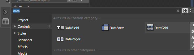
Add DataGrid

Once you see it, select it and drag it into the second row.  This automatically added the reference to the System.Windows.Controls.Data.dll for you and changed the markup in the XAML:

   1: <navigation:Page 
   2:            xmlns="http://schemas.microsoft.com/winfx/2006/xaml/presentation" 
   3:            xmlns:x="http://schemas.microsoft.com/winfx/2006/xaml" 
   4:            xmlns:d="http://schemas.microsoft.com/expression/blend/2008"
   5:            xmlns:mc="http://schemas.openxmlformats.org/markup-compatibility/2006"
   6:            mc:Ignorable="d"
   7:            xmlns:navigation="clr-namespace:System.Windows.Controls;assembly=System.Windows.Controls.Navigation"
   8:            xmlns:data="clr-namespace:System.Windows.Controls;assembly=System.Windows.Controls.Data" x:Class="TwitterSearchMonitor.Views.Search"
   9:            d:DesignWidth="640" d:DesignHeight="480"
  10:            Title="Twitter Search Page">
  11:     <Grid x:Name="LayoutRoot">
  12:         <Grid.RowDefinitions>
  13:             <RowDefinition Height="32"/>
  14:             <RowDefinition/>
  15:         </Grid.RowDefinitions>
  16:         <StackPanel HorizontalAlignment="Left" Margin="0,-32,0,0" VerticalAlignment="Top" Grid.Row="1" Orientation="Horizontal">
  17:             <TextBox x:Name="SearchTerm" FontSize="14.667" Margin="0,0,10,0" Width="275" TextWrapping="Wrap"/>
  18:             <Button x:Name="SearchButton" Width="75" Content="SEARCH"/>
  19:         </StackPanel>
  20:         <data:DataGrid x:Name="SearchResults" Margin="0,8,0,0" Grid.Row="1"/>
  21:     </Grid>
  22: </navigation:Page>

Notice the xmlns:data in the top.  This is how, after adding a reference to the assembly, you add non-core controls to the XAML.  Then to use them you’ll see the data:DataGrid element in the Grid.  Your XAML now should look a bit like mine and visually it looks like this:

Final initial layout

Notice in the XAML that I gave x:Name’s to my TextBox (SearchTerm), Button (SearchButton) and DataGrid (SearchResults).  This will help us later easily program against these elements.

Now if you go back to Visual Studio you may see a prompt to reload the project.  This is because Blend altered the project file by adding a reference to the DataGrid control.  You can go ahead and reload it.  This shows how integrated the tools are at the project file level.  Now we can start coding again using VS.

Changing our UriMapper to default to Search.xaml

Now that we just created the Search page (which is essentially our home page of the application), let’s make a few changes to the navigation framework.  In MainPage.xaml find the Frame and make a few changes to change the default from Home.xaml to our Search and making some other default changes as well.  Your Frame XAML should now look like this:

   1: <navigation:Frame x:Name="ContentFrame" Style="{StaticResource ContentFrameStyle}" 
   2:               Source="/Search" Navigated="ContentFrame_Navigated" NavigationFailed="ContentFrame_NavigationFailed">
   3: <navigation:Frame.UriMapper>
   4:   <uriMapper:UriMapper>
   5:     <uriMapper:UriMapping Uri="" MappedUri="/Views/Search.xaml"/>
   6:     <uriMapper:UriMapping Uri="/{pageName}" MappedUri="/Views/{pageName}.xaml"/>
   7:   </uriMapper:UriMapper>
   8: </navigation:Frame.UriMapper>
   9: </navigation:Frame>

Because we don’t need the Home.xaml anymore, go ahead and delete it from the project.  Also add a new view called History.xaml and alter the MainPage.xaml LinksBorder area to include a link to that:

   1: <Border x:Name="LinksBorder" Style="{StaticResource LinksBorderStyle}">
   2:     <StackPanel x:Name="LinksStackPanel" Style="{StaticResource LinksStackPanelStyle}">
   3:  
   4:         <HyperlinkButton x:Name="Link1" Style="{StaticResource LinkStyle}" 
   5:                          NavigateUri="/Search" TargetName="ContentFrame" Content="home"/>
   6:                          
   7:         <Rectangle x:Name="Divider1" Style="{StaticResource DividerStyle}"/>
   8:         
   9:         <HyperlinkButton x:Name="Link2" Style="{StaticResource LinkStyle}" 
  10:                          NavigateUri="/History" TargetName="ContentFrame" Content="history"/>
  11:                          
  12:         <Rectangle x:Name="Divider2" Style="{StaticResource DividerStyle}"/>
  13:  
  14:         <HyperlinkButton x:Name="Link3" Style="{StaticResource LinkStyle}" 
  15:                          NavigateUri="/About" TargetName="ContentFrame" Content="about"/>
  16:  
  17:     </StackPanel>
  18: </Border>

Now our rendering if we run it should look like this:

Final layout rendered

Now that we’ve got the basics of the layout, let’s start adding data in part 3.